Signage as a silent language: social norms and invisible power
Signage rarely makes headlines. It is present in airports, hospitals, museums, metros, streets and parks… yet its power lies precisely in going unnoticed. It is a silent language that organises our daily lives, sets boundaries, guides our movements and, at the same time, reflects the culture and norms of the society that produces it.

When it works, we hardly notice it. But a misplaced arrow, an ambiguous pictogram or a confusing map can turn the experience of a space into a maze of frustration. That is when signage reveals its true weight: it is not a minor accessory, but a device of order, accessibility and, in many cases, power.
Today, this language faces new challenges. The visual saturation of cities, our growing dependence on mobile phones for navigation, and the social tensions that emerge in public spaces have turned signage into a field of cultural and political debate. Designing a wayfinding system is not only about choosing typefaces or icons, but also about asking: whom does it include? Whom does it leave out? Which behaviours does it legitimise? Which hierarchies does it reinforce?
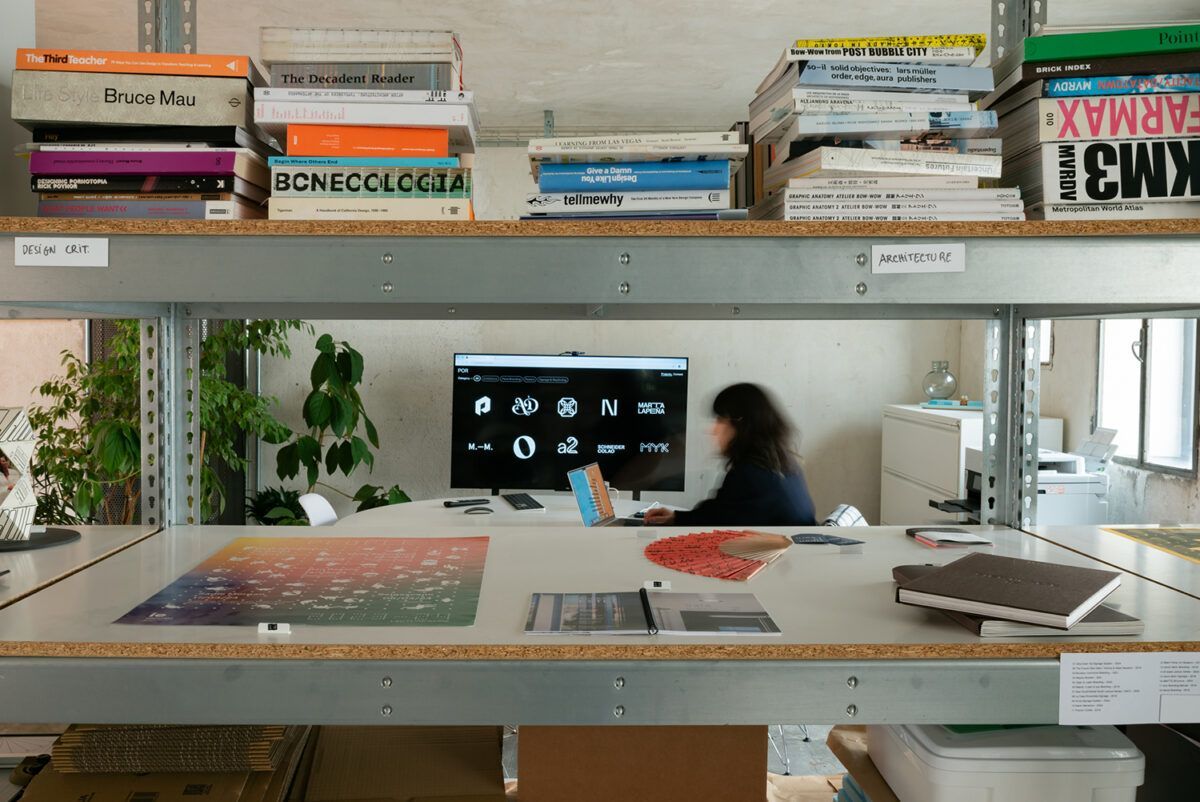
It is in this intersection of design, society and power that “A Sign Is…”, the book by Jeffrey Ludlow, founder of POR Studio, takes its place. More than a compendium of signs, it is an invitation to look at the everyday differently, and to recognise how these seemingly neutral visual systems are, in fact, mirrors of who we are.
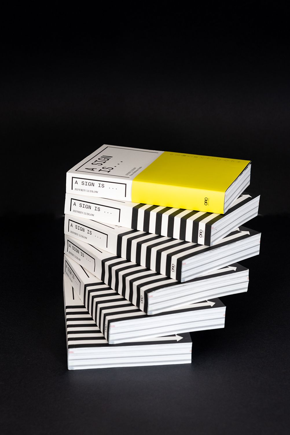
To explore this tension between design, power and culture more deeply, we recently spoke with Jeffrey Ludlow.
“A Sign Is…” is a meditation on how signs shape the way we navigate the world, but also on what they silently say about us. What led you to write this book? Was there a personal or professional trigger?
The idea for this book was sparked during the Pandemic, a time when the boundaries between the personal and professional became increasingly blurred. Although I’ve been working in Signage & Wayfinding for over 20 years, this wasn’t my first encounter with the subject. Yet, as I walked through an emptied city during lockdown, I began to notice signage in a new way. With fewer people on the streets, the signs stood out more clearly, not just in their visibility, but in their variety: traffic signs, neighborhood markers, shop signs, and countless others.
This growing awareness led me to create short Instagram stories highlighting different signs of interest. However, as the research deepened, the scope quickly outgrew the limitations of instagram stories. That’s when I realized it was time to dedicate myself to a more comprehensive project: researching and writing a book on signage typologies.

In the introduction, you state that signage is not neutral. Do you think most people are aware of how these visual systems reflect — and sometimes reinforce — our social norms, fears or hierarchies?
Most people probably aren’t fully conscious of signage and often blow by these signs and fail to read the power dynamics or societal practices at play within these seemingly neutral and functional carriers of information.
Signage tends to be seen as practical. Something that simply directs or informs, so that its cultural and political weight often goes unnoticed. But every choice in a signage system, from the symbols it uses to the languages it prioritizes, carries assumptions about who belongs, what behaviors are expected, and which identities are centered or marginalized.
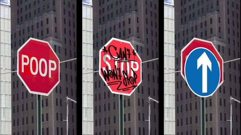
Designers, planners, and institutions are often more aware of these dynamics, but for the general public, it usually takes a moment of friction—when someone feels excluded, confused, or even policed by a sign—for the underlying power of these systems to become visible and less neutral. And it’s in those moments of encounter that things get interesting: the public may push back, whether through playful pranks, acts of vandalism, or deliberate sabotage.
One section of the book, “A Sign Is Forbidden”, explores how certain visual messages are so explicit that they reveal the breaking of a rule even before we see it. What does this tell us about human behaviour and social boundaries?
I see this from two perspectives: a Western view and a more Eastern view. In the West, regulatory signs in public spaces are often seen as annoyingly dry lists of restrictions imposed by some distant, nitpicky authority. These signs frequently become the first targets of vandalism, a silent protest against rules that feel imposed rather than understood.
“The effectiveness of a sign, depends largely on its tone.”
Contrast this with Japan, where public spaces are minimalistic and meticulously clean, and social behavior is guided by strong habits and manners. There, even smoking etiquette signs—created, funded, and printed by the Japan Tobacco Association—communicate rules with humor and clarity. They tell people not just where to smoke, but how to dispose of their cigarettes responsibly, often using visual cues that stick in the mind.
I will always remember these Japanese signs because they are engaging, playful, and suggestive rather than dry and dogmatic. The effectiveness of a sign, I believe, depends largely on its tone. A simple warning about a fine for smoking is far less memorable than a sign that visually explains the risks of smoking, especially its potential impact on children.
We tend to ignore signage… until it fails, confuses or unsettles us. Do you think this “functional silence” works for or against its power as a design tool?
This is a great question as it really highlights the paradoxical nature of signage. “Functional silence” is actually a mark of good design, it reduces cognitive load, prevents disorientation, and lets people focus on their purpose (navigating, exploring, shopping, traveling, etc.) rather than on the sign itself. In that sense, its subtlety is a design advantage, because it achieves clarity without demanding attention.
“Functional silence is actually a mark of good design.”
However, the same invisibility can also work against signage as a design tool. Because it often goes unnoticed, people undervalue the design process and only realize its importance when something fails: a missing sign, inconsistent typography, ambiguous icons, or poor placement. When that happens, signage shifts from being a quiet guide to being a source of stress and attention.
What would you say is the greatest challenge today in designing wayfinding systems in a world oversaturated with visual stimuli?
I believe the greatest challenge in wayfinding today isn’t the sheer amount of visual stimuli, but our overreliance on handheld digital technologies. This reliance has reshaped two key aspects of wayfinding: how we navigate spaces and how we interpret spatial information.
When was the last time you navigated a walk through your own city without consulting Google Maps or Apple Maps? Our phones store the entire world’s maps at our fingertips, and we have become so tethered to them that we are gradually losing our intuitive sense of direction. Relying on phone-based navigation makes us hyper-focused on reaching our destination, often at the expense of experiencing the journey itself. Yet so much of city orientation depends on the sights, sounds, smells, and experiences along the way. Following a digital arrow, we shut down much of our sensory awareness, missing the stimuli that build our spatial memory. Getting lost, in fact, is one of the best ways to strengthen this memory for future journeys.
“The greatest challenge in wayfinding is our overreliance on digital technologies.”
For wayfinding designers, this presents a dual challenge. We must guide users who are often partially distracted by their devices, while ensuring that when they do turn to physical signage, it offers more than a mere digital-style arrow. Signage must provide meaningful, legible information that supports real understanding, not just incremental nudges.
A related challenge lies in how audiences now interpret map information, filtered through the lens of phone UI/UX. Younger generations, for instance, often struggle with traditional paper maps. Digital maps move dynamically with your position, so many new city signage systems have adopted “track-up” orientation—where the map rotates to align with the user—rather than the static north-up format. This is a clear example of how digital tools have shaped the way we read and understand physical maps, and how signage design must adapt to these new expectations.
In your research and practice, what elements make a signage system truly “intelligent”? What does a good sign mean to you?
A well-designed signage system achieves two essential goals.First and foremost, it should elevate the experience of the building rather than distract from it. Signage ought to respond to the architectural and interior design language, integrating seamlessly with its surroundings. At its best, it becomes part of the placemaking process by enhancing both the environment and the user’s journey through it.
Equally important is functionality. A signage system must guide people effectively, not through an abundance of signs, but by doing more with less. The information should be intuitive, delivered at just the right moment and in just the right amount. No more, no less.
Ultimately, a good sign strikes a balance between personality and function. It feels natural, inevitable, as though no other design solution could exist and it was designed for that purpose, project and place.
Which projects — either yours or by others — do you think best illustrate the idea that “a sign is more than a sign”?
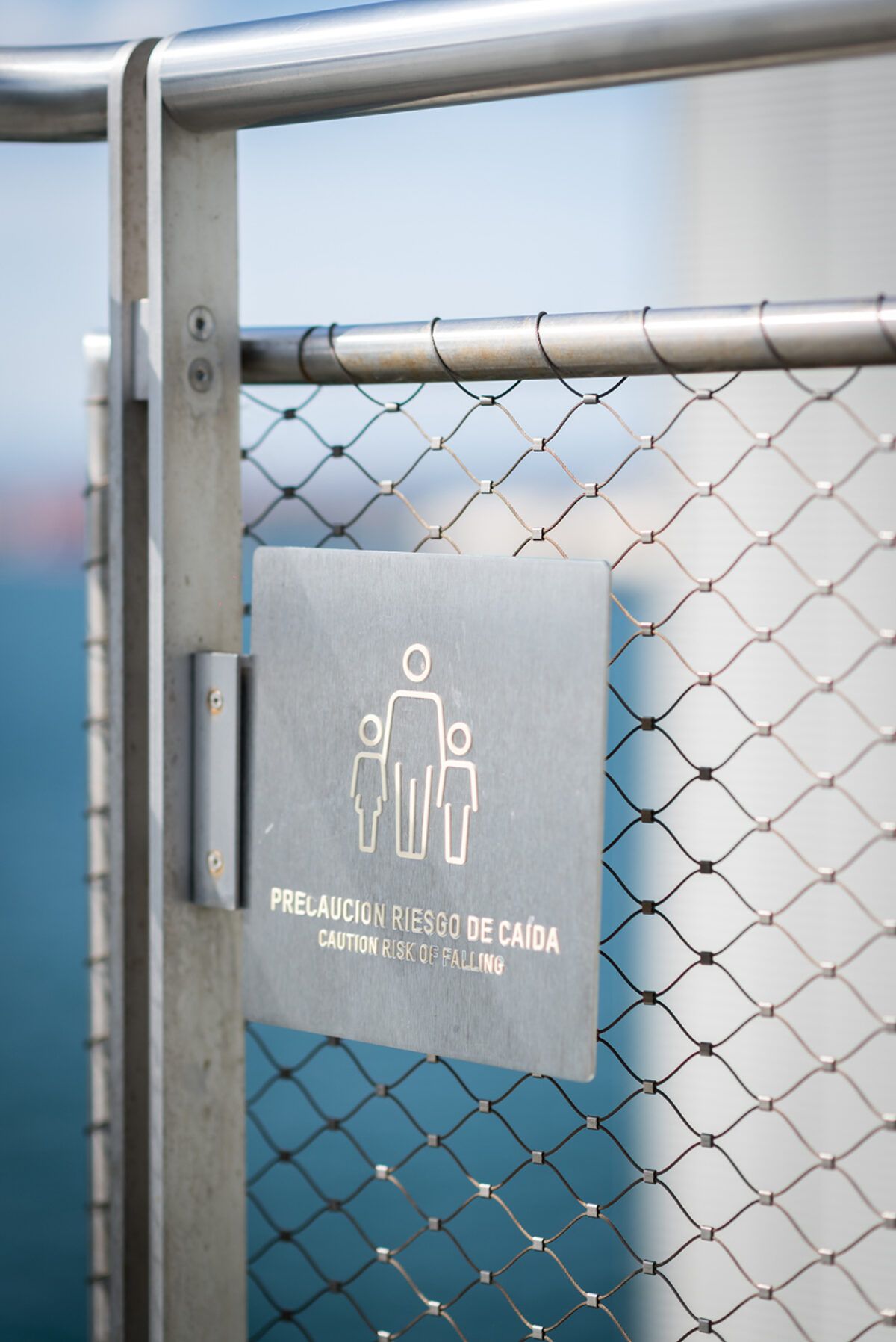
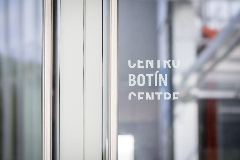
When designing the signage system for Centro Botín, we anticipated that it would grow into a cherished cultural landmark, so the signage needed to reflect the tone and character of the building’s two floating volumes. The typography and execution carried a precise, almost mechanical quality, while many elements were seamlessly integrated into the architecture itself.
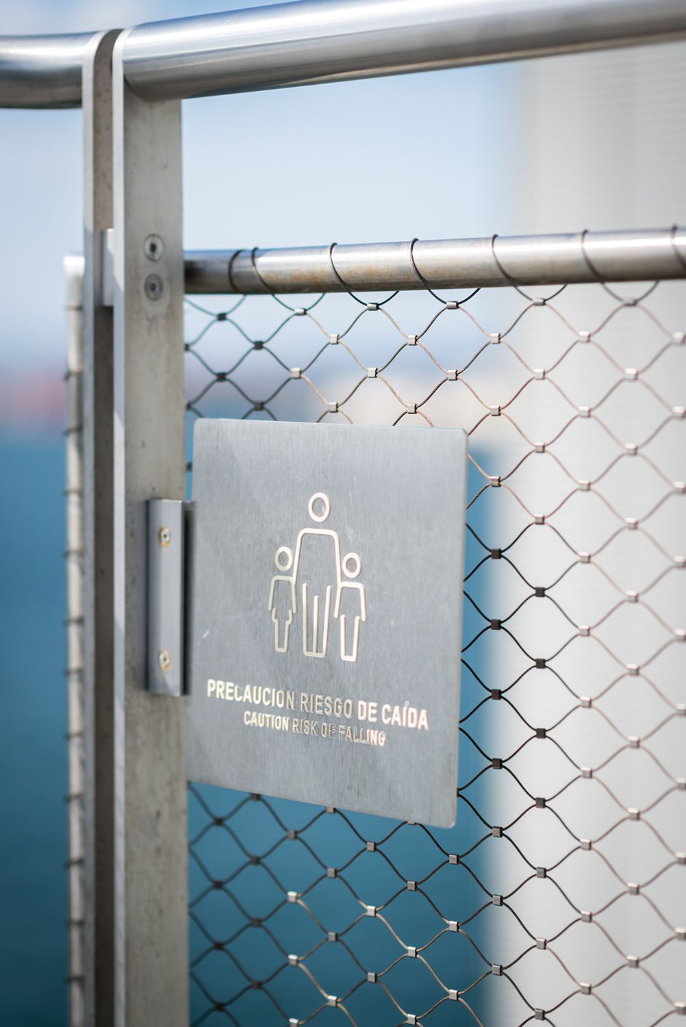
Materials were carefully selected to endure the salt, wind, and sun of Santander’s coastal environment. This led to signs that were bespoke and unique to the building and how they attached, which led to signage interplaying with the architecture.
Can you share an example of a time when signage changed your perception of a space?
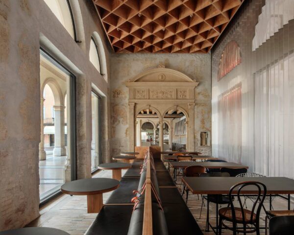
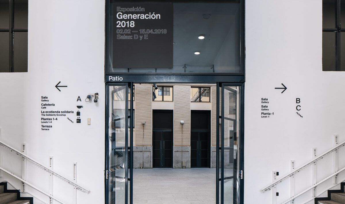
In 2018, we redesigned the signage system for La Casa Encendida. Previously, the institution’s identity was tied to Caja Madrid and expressed through a bright, almost neon green. This color dominated the entire signage system, linking it to the brand but overwhelming the building itself. The saturation of green distracted from the architecture, diminishing its elegance. I often described these signs as “green barnacles” that needed to be scraped away to let the building’s character reemerge. Our proposal, built around a restrained palette of black, white, and gray, allowed the architecture to speak for itself. The new system not only clarified navigation but also improved accessibility throughout the building and in turn placing La Casa Encendida, alongside the Guggenheim, among the most accessible public spaces in Spain.
“A good sign strikes a balance between personality and function.”
What role does intuition play in the design of wayfinding and orientation systems?
This is a difficult question to answer, as people navigate and understand space in very different ways. Spatial recognition can be either an innate ability or a developed skill. It can come natural to some but challenging for others. What feels intuitive for one person may not be for another. When we design a strategy for signage and the distribution of information within a space, we use signage typologies that ensure everyone can understand key spatial decisions and decision points, regardless of their level of spatial recognition. In other words, even if someone has little to no sense of spatial orientation, they are still guided and informed.
In some cases, however, we also incorporate what are known as wayshowing devices or subtle environmental cues such as a change in carpet color or lighting patterns that signal a transition within the space. These are typically coordinated with other design disciplines, such as architects and interior designers, to create a cohesive experience. Whereas signage communicates information explicitly, wayshowing encourages users to sense and intuit changes in their environment without needing it spelled out.
In your work with POR Studio, how do you approach balancing functionality, beauty and sensitivity in real-world environments?
Raymond Loewy, the renowned industrial designer, developed the theory of M.A.Y.A.—”Most Advanced Yet Acceptable”. I often return to this idea when navigating the balance between design ambitions and real-world needs. Ultimately, our design direction must be tailored to the project, the client, and the program, while also gaining acceptance from the many stakeholders involved: architects, designers, clients, and sometimes even the marketing team.
Every project becomes a negotiation, a constant push and pull between the innovative steps we believe will move design forward and the level of change the client is ready to embrace.
If you could redesign the signage of an iconic place — a city, an airport, a museum, a national park… — which would it be and why?
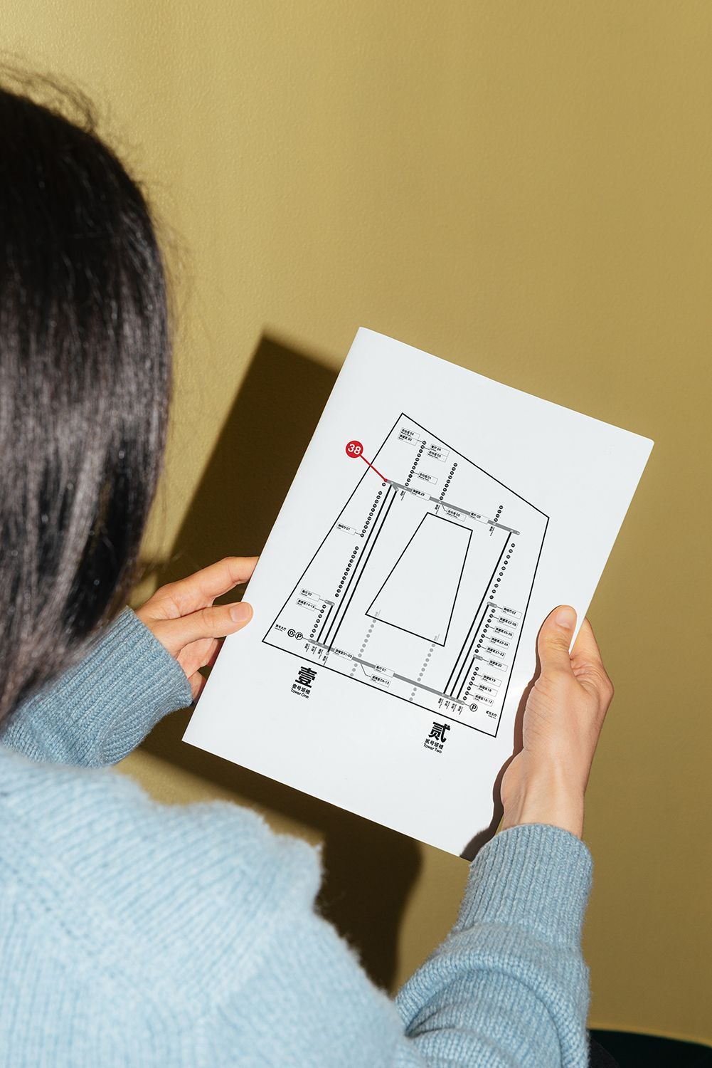
A dream project of ours would be to design or redesign a closed transit system like a metro. Metro systems are lifelines of their cities, moving millions of people every day, yet their signage often struggles to balance history, functionality, and clarity. There is something that is so iconic about certain metro signage systems that we would love to take a crack at designing the Metro signage system from scratch.
“A dream project of ours would be to design or redesign a closed transit system like a metro.”
This would not just mean designing the form of the signs, but redoing the current system from scratch with the typography, the pictograms, the map system, and how it is deployed within a myriad of stations. That would be a real challenge but an epic project.
What do you hope to spark in readers of “A Sign Is…”? What would be the best outcome you’d like it to provoke?
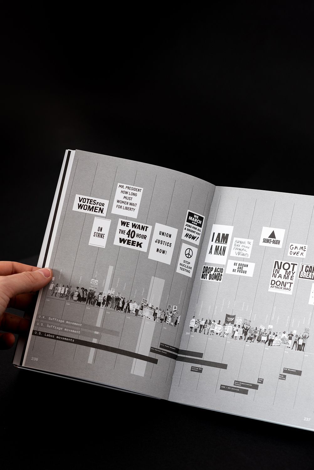
This book was never intended to top a bestseller list, it’s a deep dive into a very specific subject, created by a design nerd for fellow design nerds. The book is niche by design, unapologetically focused, and written with the kind of obsessive detail that only someone immersed in the world of design would truly appreciate.
Every so often, maybe once a month or so, we hear from someone who tells us the book absolutely made their day. And honestly, that’s the highest compliment we could hope for. It means the book found its people. It means another design nerd saw it, got it, and stamped it with their seal of approval. And for us, that kind of recognition is more valuable than any spot on a best-seller list.
Reflection and Analysis
The art of the invisible
Effective signage is silent, yet firmly present. When it flows seamlessly, we experience ease, orientation and reassurance. This is no accident; it is the result of deliberate decisions in typography, placement, colours, materials and visual narratives. “A Sign Is…” reveals this invisibility as a mark of success — and its failure as a revealing opportunity.
Spaces as social mirrors
Every sign carries with it stories, assumptions and power relations. By ignoring this political and cultural dimension, we fail to understand how spaces include (or exclude), shape identities or reinforce hierarchies. The book urges us to look with fresh eyes, and perhaps to reconsider.
The Digital Challenge
Visual saturation and the omnipresence of screens have dulled our spatial sensitivity. While digital maps are undeniably useful, they weaken our connection with the places we inhabit. Well-designed physical signage can restore that contemplative and sensory experience.
Responsible and Inclusive Design
Projects such as Centro Botín or La Casa Encendida show how good signage enhances rather than overshadows. It integrates with elegance, improves accessibility and respects the architecture. Signs that feel organic, inevitable, appropriate. That is what makes a sign much more than a piece of text or an arrow.
Conclusion
Signage is a language that speaks without words. It is there — discreet, almost invisible — yet it determines how we move, how we interact with a space and, at times, how we feel within it. When a sign is missing, fails or misleads, its power — previously imperceptible — suddenly becomes strikingly apparent.
In his book “A Sign Is…”, Jeffrey Ludlow highlights this paradox: signs can be visual poetry, or they can become subtle instruments of oppression. It all depends on how they are conceived, designed and implemented. From his experience at Point of Reference Studio (POR), he reminds us that creating a wayfinding system is not merely a functional task. It is also a political, aesthetic, cultural and profoundly human act.
Ultimately, a good sign does more than point the way: it builds an experience, shapes a memory and invites us to see the world differently.
(*) Photos courtesy of POR Studio.