Gelateria HANRO: flavours, seasons and memory in Seoul
In just 16 square metres, Minwoo Ian Yang translates the ever-changing identity of Gelateria HANRO into architecture: a project born around seasonal flavours, small family rituals and an understanding of time that also leaves room for imperfection.
Gelateria HANRO began long before it had a physical home in Seoul. Its origins lie in Hanro-at-Home, a family ritual centred on making gelato for the founder’s son using seasonal ingredients. The recipes evolved according to what each time of year had to offer and, little by little, that domestic gesture began to shape a brand in which flavour, care and seasonality remain closely intertwined.
Its name encapsulates part of that philosophy. Hanro, meaning ‘cold dew’, is one of the 24 seasonal divisions of the traditional East Asian calendar, conceived to identify more precisely the subtle transformations that take place in nature throughout the year.
When the time came to translate this identity into a physical space, designer Minwoo Ian Yang, in collaboration with Spacetaskgroup, found in this relationship with change the starting point for creating HANRO’s new home.
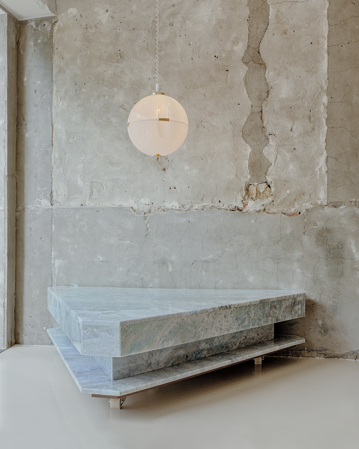
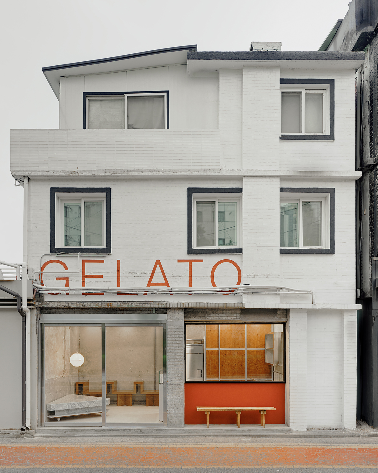
Everything unfolds within just 16 square metres in Yeomni-dong, in Seoul’s western district of Mapo-gu. A tiny space where the seasons enter through the windows, furniture can shift position and traces of those who occupied the building before remain embedded in its walls.
The seasons enter through the window
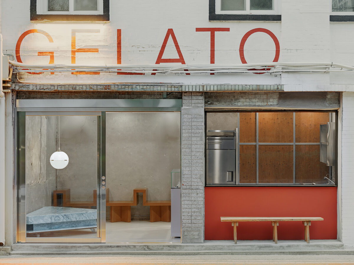
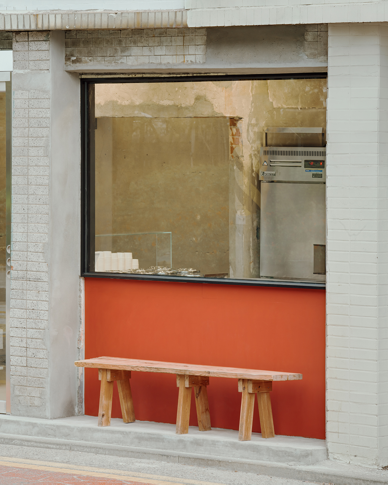
HANRO occupies the ground floor of a white-painted brick building on Baekbeom-ro, opposite Gyeongui Line Forest Park. Developed along the route of a former railway line, this green corridor introduces a natural presence that is particularly important to understanding the project.
The seasons enter through the windows, furniture can shift position and traces of those who occupied the building before remain embedded in its walls.
The location allowed the park’s changing landscape to become part of the interior without having to represent nature literally.
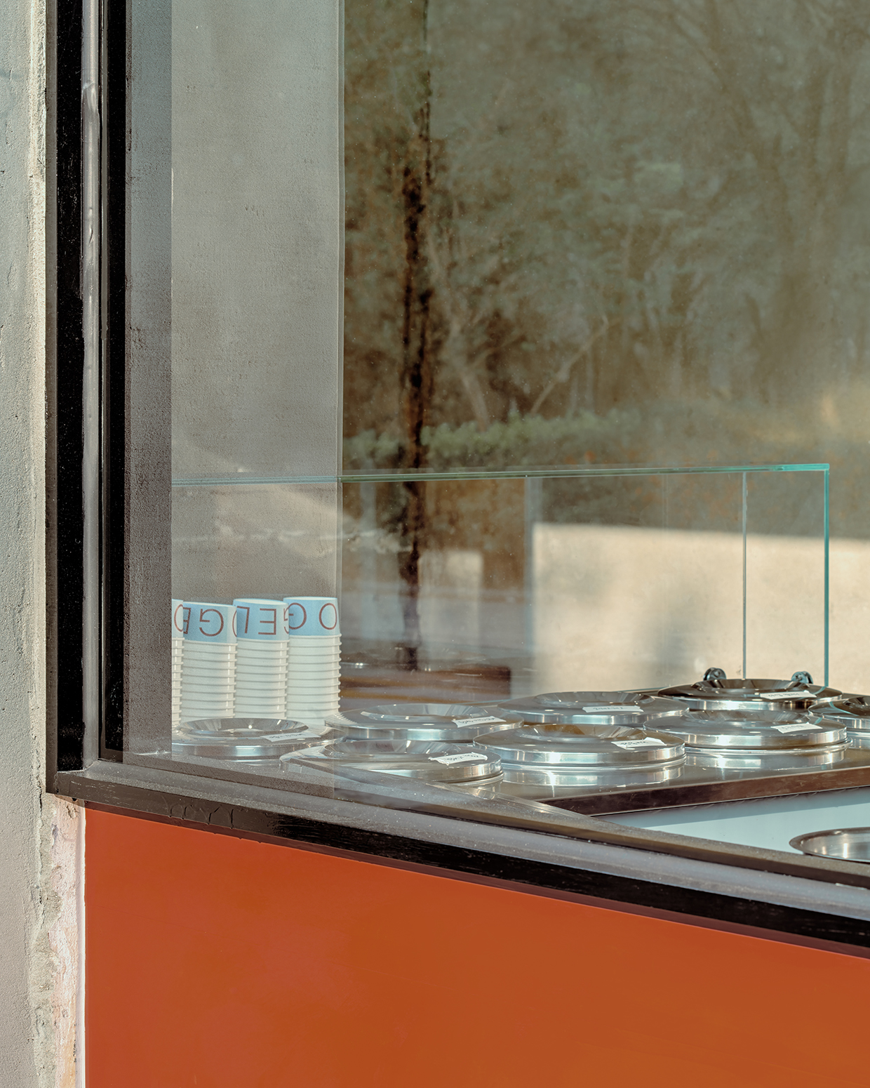
Large floor-to-ceiling windows and glazed doors visually open the gelateria to its surroundings, while the seating is oriented towards the street. From here, vegetation, light and the everyday movement of the neighbourhood become part of the experience.
The interior takes on different nuances depending on the time of year. The trees beyond the glass change, as do the ingredients used to make the gelato. In this way, architecture and product come to share the same calendar.
Sixty years hidden beneath the walls
The history of the building emerged during demolition. As the layers accumulated through successive interventions were stripped away, remnants of a structure approximately six decades old began to surface, alongside traces of the different businesses and occupants that had passed through it.
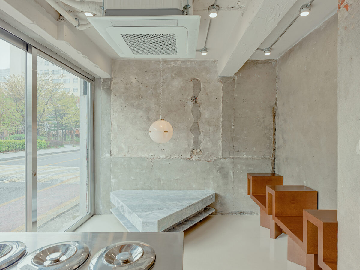
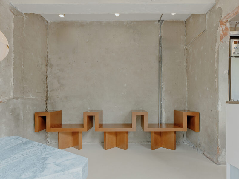
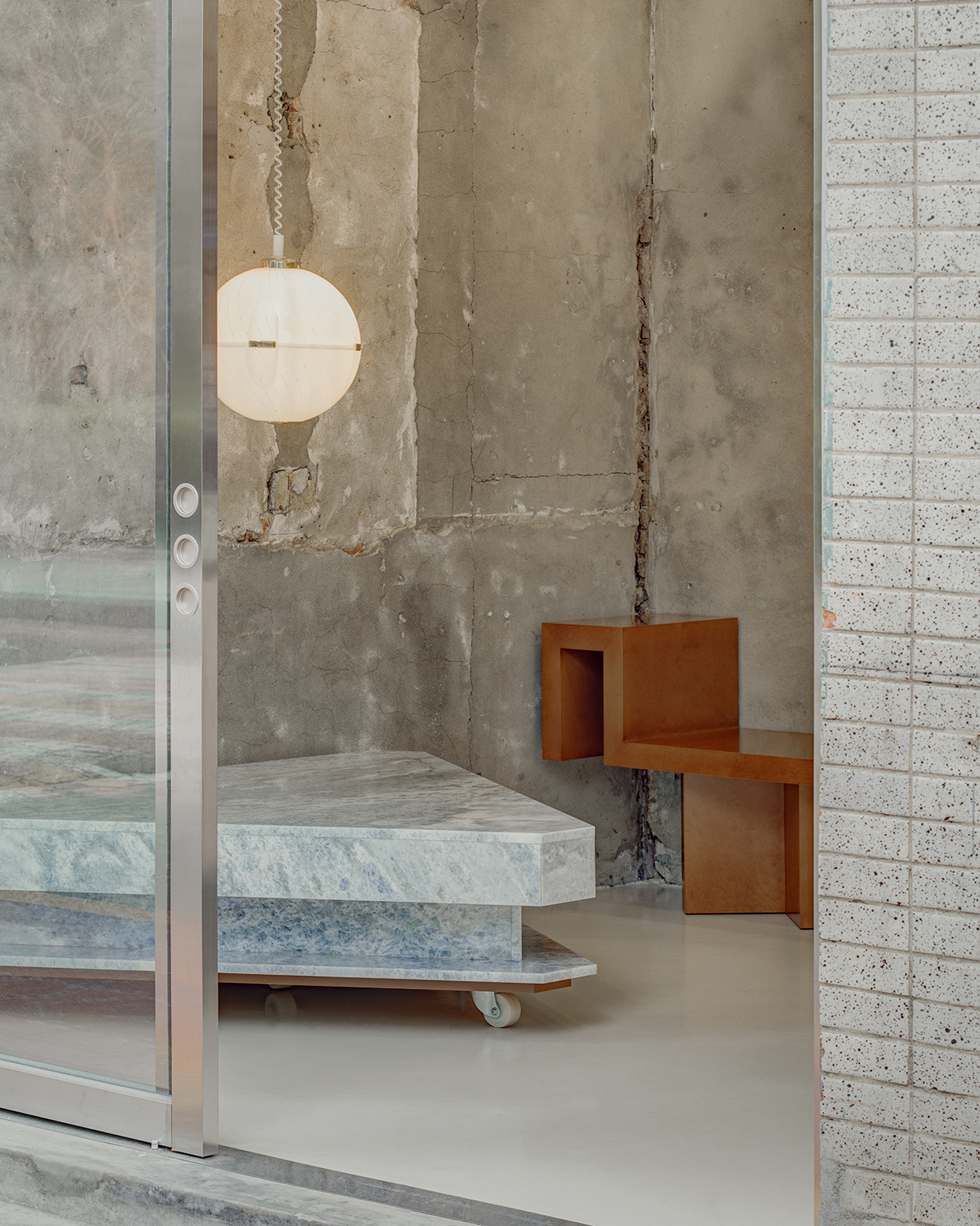
Weathered concrete, cracked surfaces, misaligned finishes and fragments belonging to different periods were exposed once again. Rather than correcting or covering them to create an entirely new interior, Yang chose to preserve many of these imperfections.
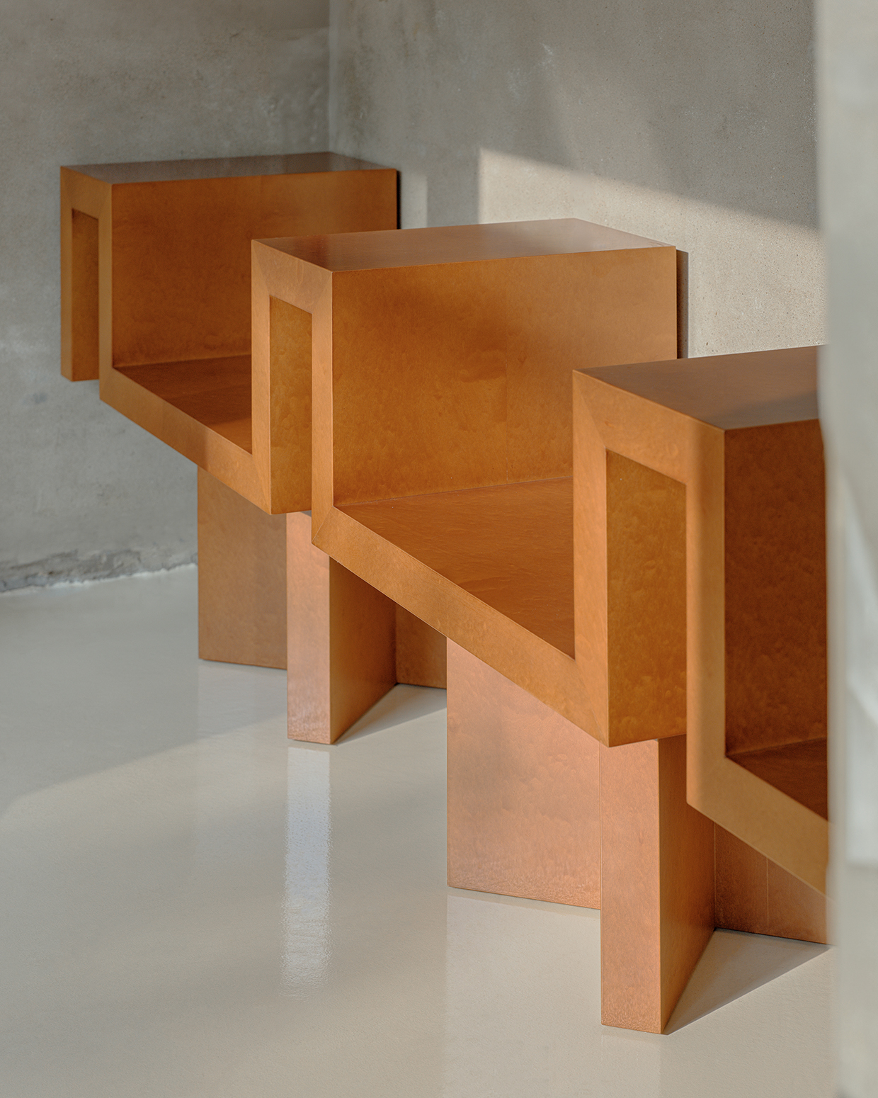
This decision prevented the space from becoming an overly controlled stage set and allowed the architecture to retain a certain spontaneity. At the same time, traces of its previous use enter into dialogue with the newly introduced elements, making visible a history that would ordinarily disappear during a commercial renovation.
Blue marble over weathered concrete
A new layer of marble, wood and stainless steel was introduced over these inherited surfaces.
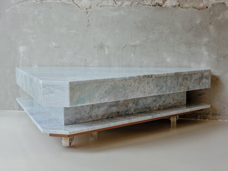
One of the most prominent materials is a blue marble with a rippled, glossy surface, its finish deliberately set against the rawness of the existing concrete. Wood brings warmth, while a traditional stainless-steel gelato counter introduces a recognisable element within a much freer composition.
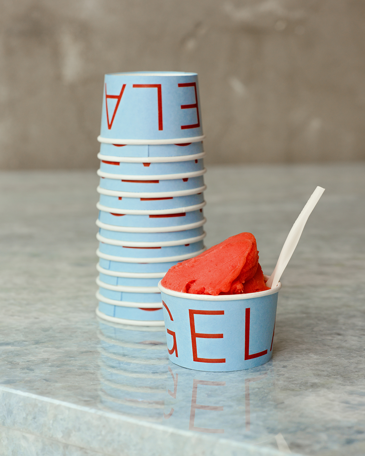
There has been no attempt to disguise the differences between these materials. Much of the project’s personality lies precisely in those distinctions.
Polished surfaces sit alongside weathered ones, new additions alongside elements that have been there for decades, and sophisticated finishes alongside surfaces that retain their cracks and marks. The interior finds coherence without relying on uniformity.
This approach responds to an idea expressed simply within the project itself: in much the same way that a brand finds clothes that feel like its own, the space needed to take on HANRO’s rhythm and personality.
Different tastes, textures and characters therefore come together within a kind of flexible order. The intention is not to achieve absolute visual perfection, but to allow elements that were not necessarily conceived to resemble one another to coexist comfortably.
Noh Pureum’s photographs capture these encounters particularly well. Intense blue appears among neutral tones and worn surfaces, while reflections across steel and marble shift as light enters from the park.
An interior that moves too
Flexibility extends beyond the materials. In such a small space, every object needs to justify its presence and adapt to the everyday workings of the gelateria.
A triangular piece of blue marble serves as a seat and is fitted with wheels, allowing it to be moved easily. Beside it, a geometric wooden bench rests against the wall without being permanently fixed in place.
The furniture can be rearranged according to the needs of the moment, avoiding a single definitive configuration for the space.
This capacity for movement introduces another timescale into HANRO. The landscape outside changes with the seasons and the menu evolves with the ingredients available, while the physical arrangement of the interior can also shift as the space is used.
Gelato, design and everyday life
A domestic dimension remains present even after HANRO’s transformation into a business open to the public.
Its story began with making gelato for someone close to the founder, and that intimate scale can still be felt in a space where there is barely any distance between product, place and customer. Its compact dimensions bring every element closer together, making the experience inevitably personal.
The cup design, created by Seojeek, carries the visual identity into the very act of eating the gelato, completing a project in which architecture, product and graphic design form part of the same narrative.
HANRO finds its character through a succession of precise decisions: preserving an imperfect wall, orienting a seat towards the trees, placing glossy marble beside weathered concrete or allowing a piece of furniture to be moved whenever necessary. These are small gestures that, taken together, construct a distinctive identity.
A space designed to age
Over time, new marks will appear, materials will change, furniture will find different positions and the landscape seen from inside will continue to transform. New ingredients and flavours will arrive too. The project by Minwoo Ian Yang and Spacetaskgroup seems ready to absorb all of this without losing its identity.
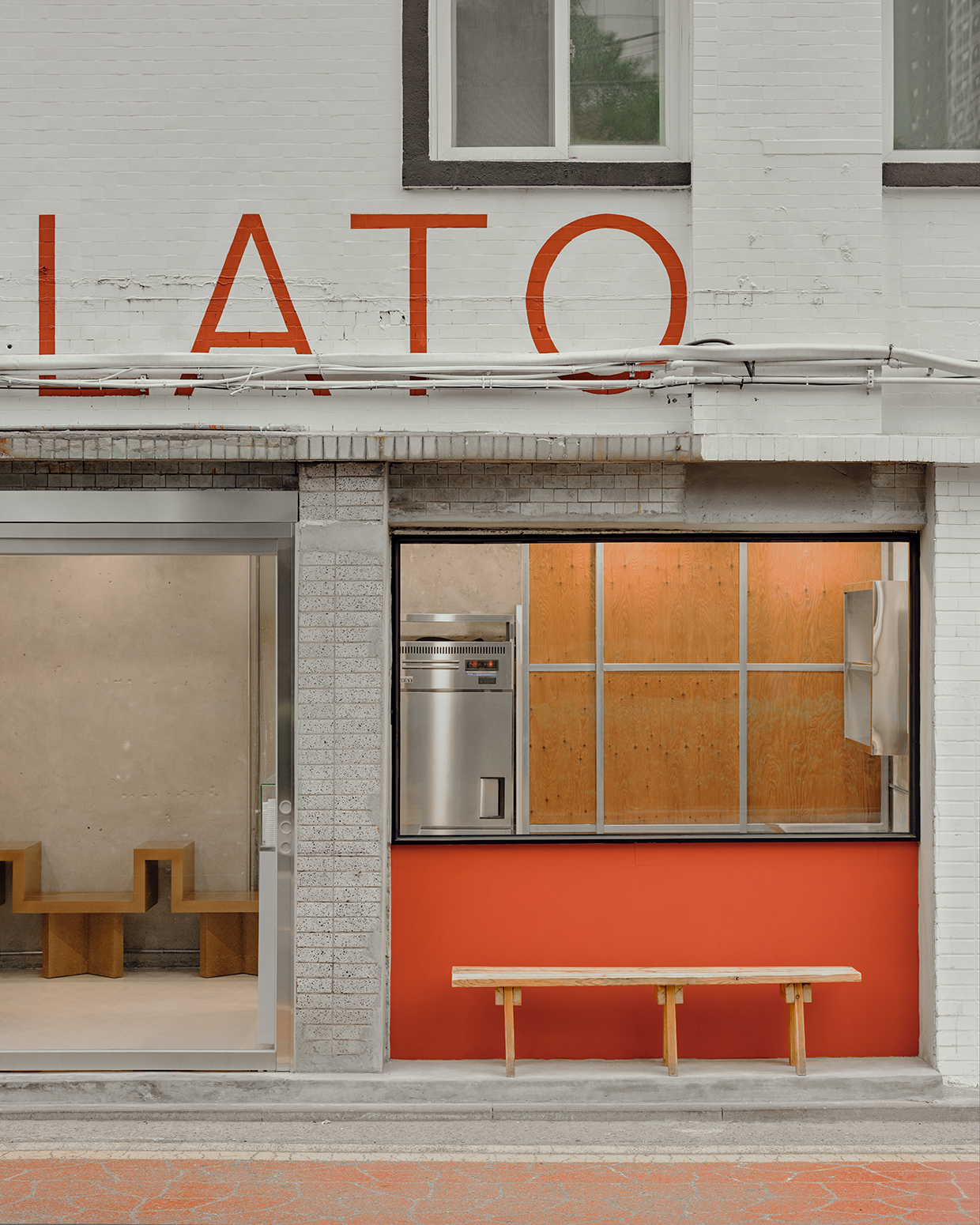
In a building that has already accumulated around sixty years of stories, HANRO simply adds another layer: one of blue marble, wood, steel, gelato and everyday life, with no need to erase what came before in order to make itself visible.
(*) Photography: Noh Pureum @npr.kr.