Vasilis Marmatakis: the visual mind behind Yorgos Lanthimos’s posters
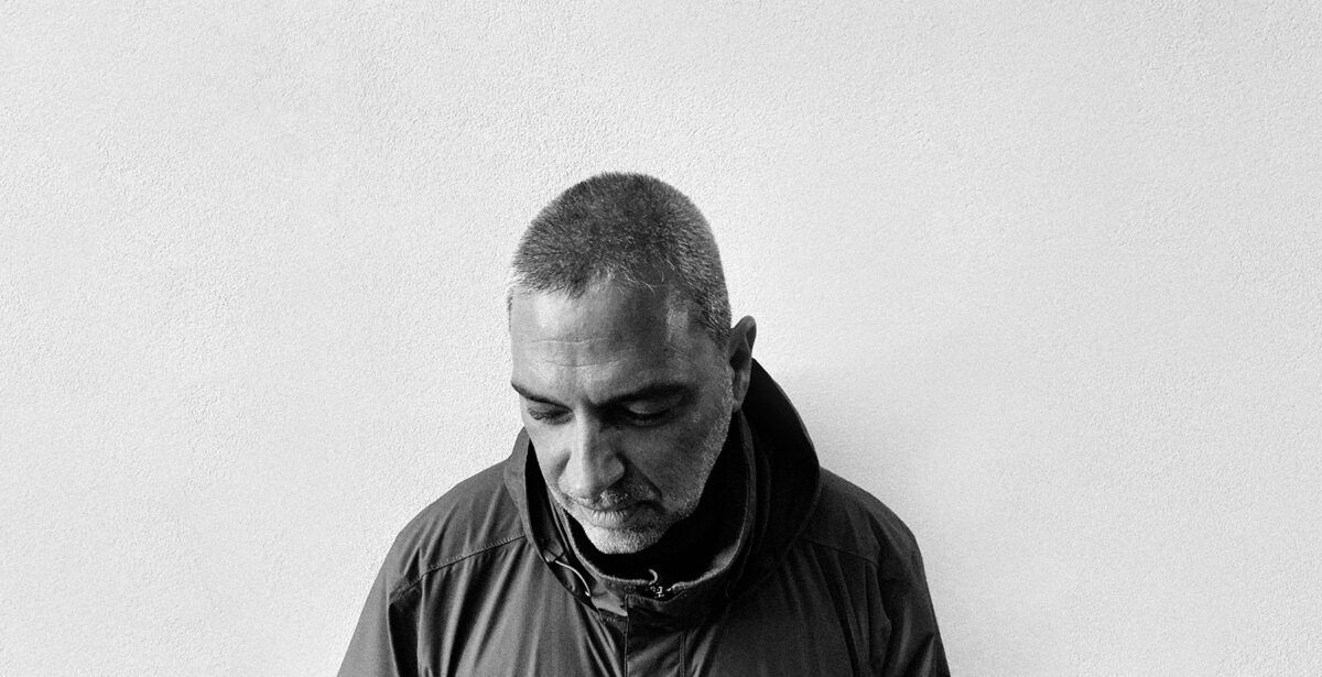
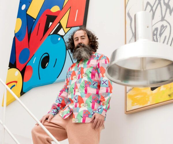
Minimal, unsettling and deeply conceptual: the posters for Yorgos Lanthimos’s films do more than promote—they create atmosphere, breed disorientation and open doors to parallel universes. Behind this visual alchemy is Vasilis Marmatakis, a London-trained graphic and visual artist based in Athens, who has been Lanthimos’s creative companion since “Dogtooth” in 2009.
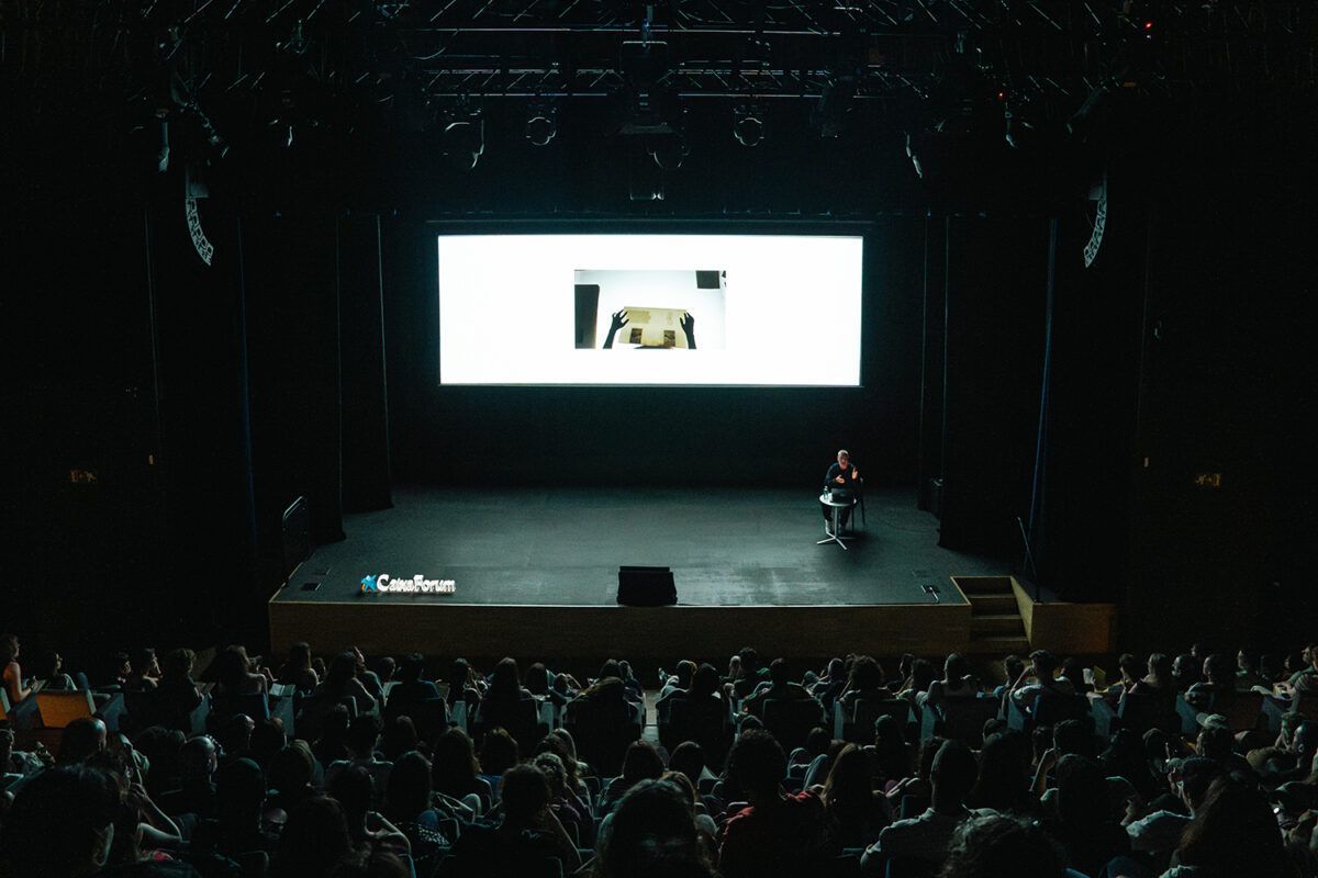
During a new and inspiring edition of the Paradís 2025 design and creativity festival, we spoke with him about how he fuses cinema, typography and emotion into posters that not only tell stories but create worlds.
An encounter in advertising that became an alliance
The connection between Marmatakis and Yorgos Lanthimos wasn’t born out of immediate creative understanding, but rather through a shared friendship. “We initially collaborated because we were both close friends with Efthimis Filippou, the screenwriter”, Marmatakis clarifies.
While their professional relationship later became solid, he’s quick to point out that Lanthimos has also worked with other graphic designers throughout his career: “It’s not just me”, he notes modestly.
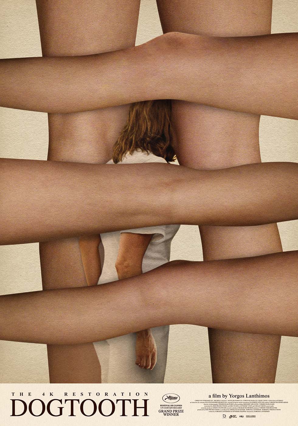
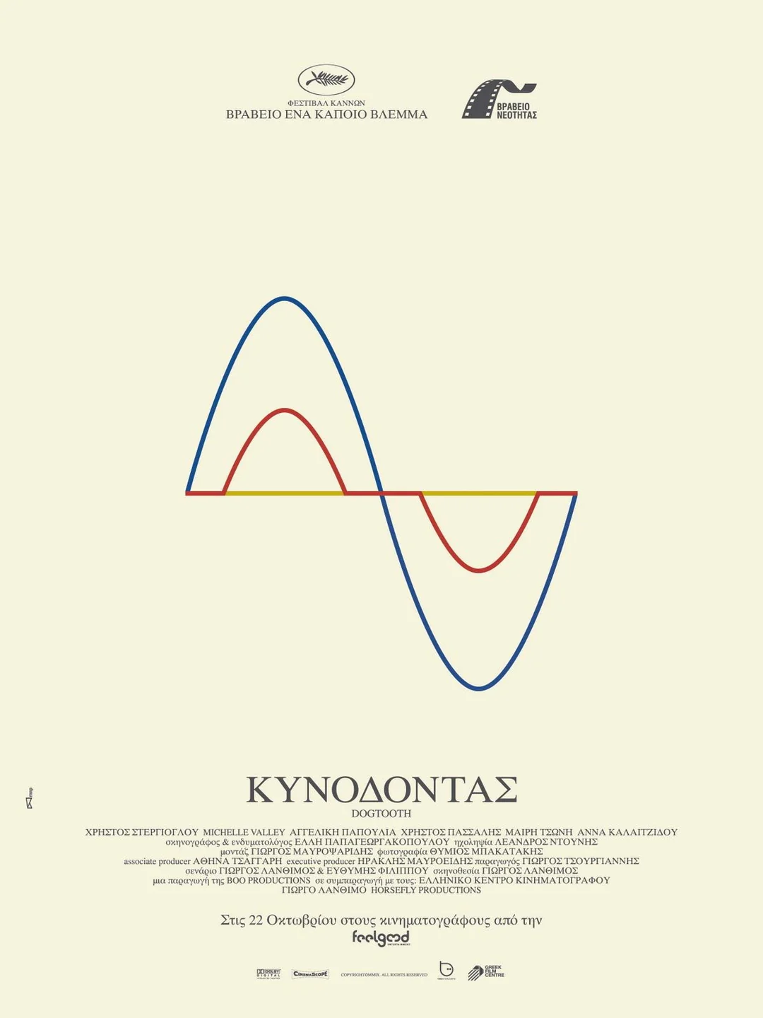
The original 2009 poster (the one shown below, as the one above is a later reinterpretation) marked the beginning of an unmistakable visual language.
Three clean lines on a white background didn’t explain the plot, but suggested the distortion and fragmented perception of the protagonist family. A cryptic gateway that resonated so strongly that those very lines reappear as a visual motif within the film itself.
“You can’t really tell the whole story with an image…”
Marmatakis argues that “you can’t tell the entire story of a film with a single image, but you can generate tension and anticipation”.
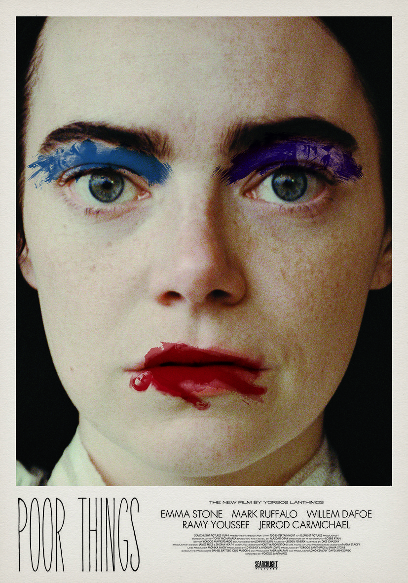
His posters are visual metaphors: in “Poor Things”, for example, he explores “adulthood, freedom, oppression, sexuality, rebirth, femininity, masculinity and power”.
They don’t show the plot; they convey emotion.
Creative freedom without limits or constraints
Whenever he takes on a new commission from Lanthimos, Vasilis receives the script, access to all photographic archives and the opportunity to visit the set — all without any graphic guidelines.
Likewise, far from idealizing their creative relationship, Marmatakis acknowledges that working with Lanthimos is a process of dialogue, testing, and revision: “Yorgos is a creative who’s always questioning, approving… but also rejecting”. While Marmatakis typically presents eight to ten concepts for each project, the collaboration isn’t built on blind trust but on a demanding and open exchange where every idea is put to the test. The fact that Lanthimos personally defends some of his poster designs to distributors and producers is rare in the industry—and speaks to the respect he has for Marmatakis’s vision.
When it comes to technique, Vasilis starts analog: he crafts collages on paper, digitises them and then prints them at 70×100 cm, using various types of paper to present them with the greatest possible fidelity. For “Poor Things”, for instance, he presented 12 proposals: a free-form, intuitive exploration of visual possibilities.
Evolution of the style
Dogtooth (2009): a minimalist and enigmatic poster, built from three black lines on a white background. Pure concept. Rather than describing the film, it aims to trigger a visual sensation that anticipates its unsettling, disorienting tone.
The design was created by MNP, the studio founded by Vasilis Marmatakis and Katerina Papanagiotou. The same lines appear in the film itself, echoing its fragmented perspective. “From the beginning, we understood that the poster shouldn’t reveal anything. Only suggest“, he recalls.
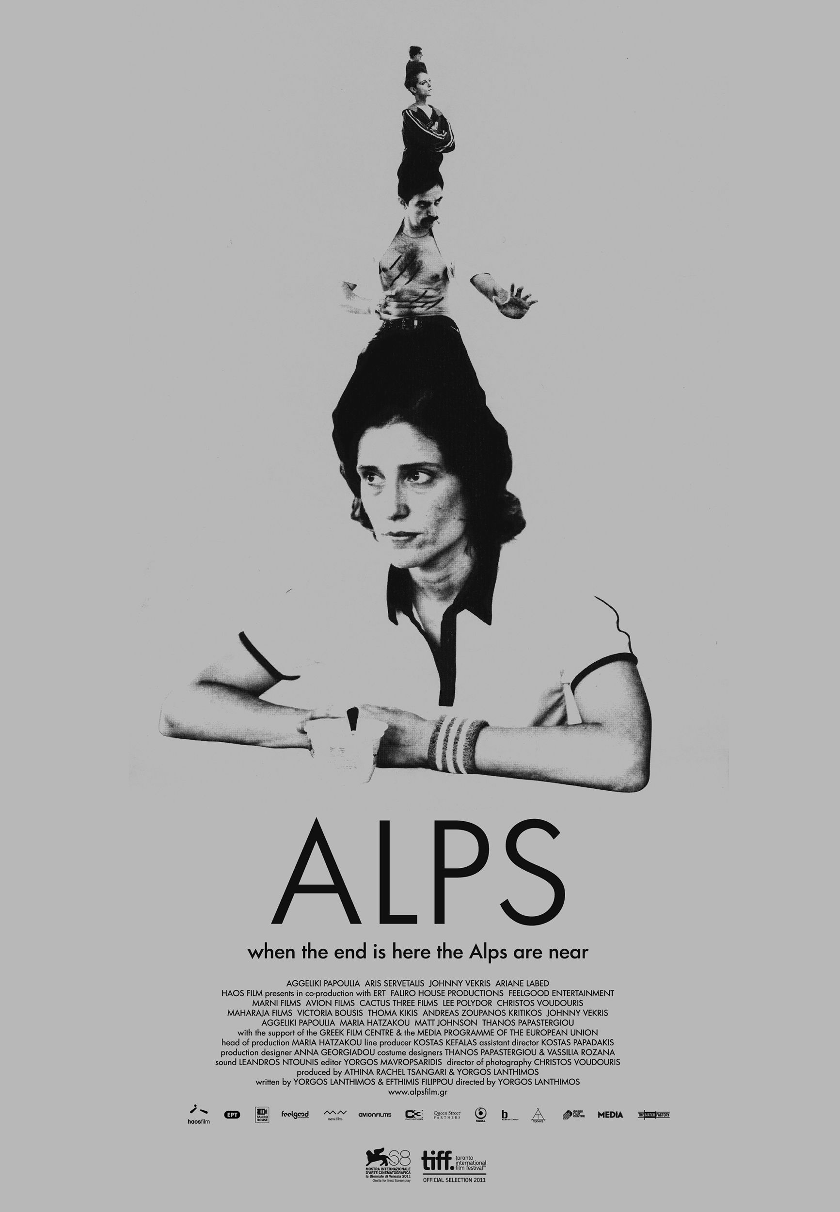
Alps (2011): a satirical, disconcerting collage that shows Everest masquerading as the Alps. An absurd image laden with irony, playing on false identity — a central theme of the film — and the notion of substitution.
“It’s Everest pretending to be the Alps”, he tells us, in perfect harmony with the film’s emotional logic. Lanthimos described it as “dark and satirical”, a perfect summary of its tone.
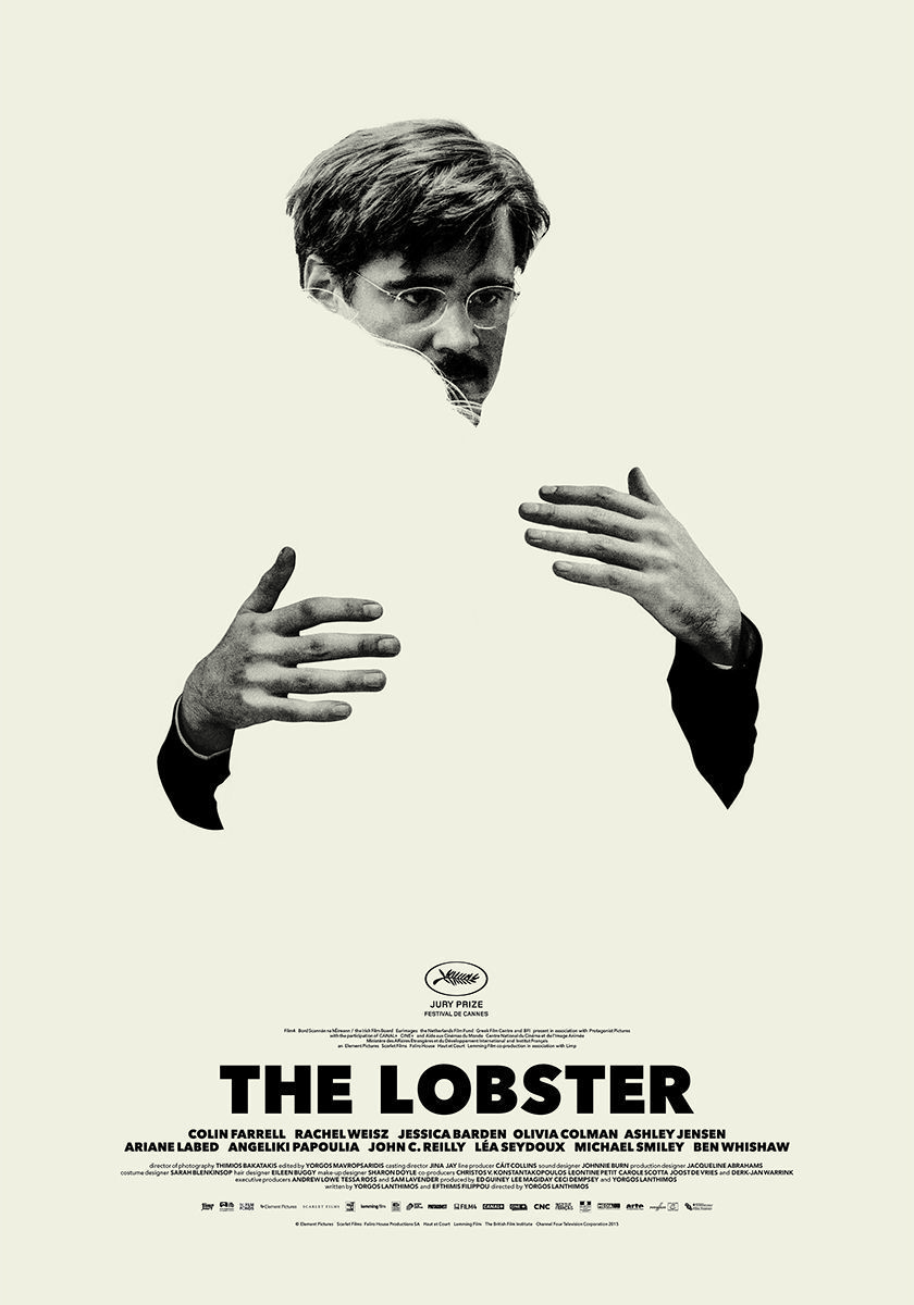
The Lobster (2015): one of his most celebrated and cryptic posters. In an unused version, Colin Farrell is embracing an invisible figure: “it’s the man in love with the very act of falling in love”, he explains.
The design evokes solitude, desire, loss — without showing anything literally. Like the film, it floats between the absurd and the profoundly human.
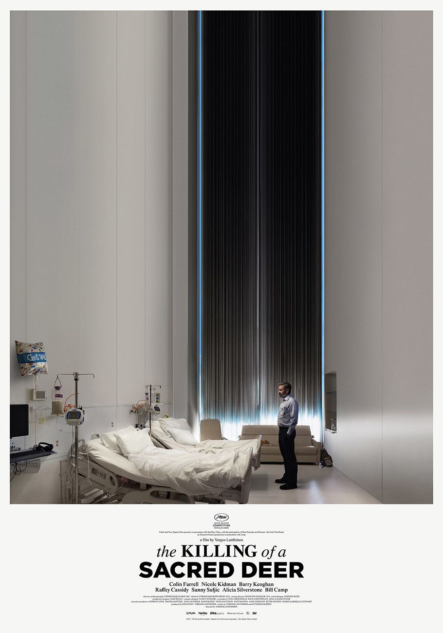
The Killing of a Sacred Deer (2017): a clinical, almost surgical image: Farrell standing rigid between two empty hospital beds. Tension suspended in the air.
The symmetry, dominant white tones and visual coldness reinforce the film’s atmosphere, allowing the spectator to sense the threat before fully understanding it.
The Favourite (2019): baroque and theatrical, like the film itself. Emma Stone and Rachel Weisz manipulate Olivia Colman’s bust, decorating it with pearls, in a composition that suggests power, control and contained violence.
The typography — a historical serif with unusual spacing — and the use of monochrome accentuate the ambiguity between sophistication and brutality.

Poor Things (2023): his most free-form and emotive proposal yet. Marmatakis creates a visual universe in which Bella Baxter’s hair becomes brushstrokes housing the faces of Ruffalo, Dafoe and Youssef. “I didn’t know how to approach it at first”, he confesses. “But once inside the film’s world, everything started to take shape”.
The poster doesn’t represent; it pulses: an emotional explosion dissecting the mind of its protagonist with texture, colour and substance.
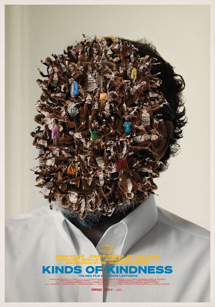
Kind of Kindness (2024): a more abstract, fragmented visual proposal, in line with the film’s episodic structure.
Marmatakis explores repetition and the breaking of visual patterns as a reflection of the script, creating a poster that doesn’t seek unity but emotional resonance. “I didn’t want to represent the characters, but rather the state of mind they were traversing”, he explains.

The result is an unsettling image, deliberately disjointed, where each element seems to suggest — rather than say — reinforcing the idea that the poster doesn’t illustrate but gently unsettles.
Negative space and typography as protagonists
Marmatakis creates visual tension through empty space, even though distributors sometimes insist on filling it with critics’ quotes or logos. “Empty space is something they don’t like, hahaha, but I think it’s necessary”.
“Empty space is something they don’t like, hahaha, but I think it’s necessary.”
He also crafts bespoke typefaces for each film: for “Poor Things”, he designed an extra thin, stretched font; for “The Favourite”, he used Village, a turn of the century serif, cut out with unusual letter-spacing.
Material & presentation: the sensory experience
Likewise, for Marmatakis, format matters as much as idea. Thus, he prints his proposals in large format on textured papers. “For ‘Poor Things’, one of the posters I printed on mirror paper… For me, it’s important to present the idea in large scale and across different textures. It’s an experience”.
Influences and early passion
His creative roots are deeply grounded in music design—a world of album covers, visual rhythm, and symbolic resonance—alongside strong influences from cinema, contemporary art, minimalism, and the irreverent playfulness of Dadaism. These references shape not only his aesthetic sensibility but also his way of thinking about composition and meaning.
Marmatakis carefully organises his ideas into reference folders, an ever-growing archive of inspiration he draws upon when beginning a new project. “The more you work, the more ideas emerge”, he says, highlighting how the creative process feeds itself over time. It’s a system of quiet accumulation and intuitive response, where every new design is informed by years of looking, collecting and thinking.
Beyond Lanthimos: expanded creativity
In addition to designing for Lanthimos’s next film, Marmatakis works on visual identities (for an architect), a musical project with Kim Deal (Pixies), another with the great Dimitris Papaioannou… His creativity flows beyond the cinema.

An alliance that transcends the visual
As you can see, the symbiosis between Marmatakis and Lanthimos is far more than aesthetic: it is narrative, emotional, symbolic.
Cinema awakens design, and design, in turn, amplifies cinema. Far from summarising the story, their posters build atmospheres, spark questions, open doors to the intangible. With unexpected compositions, visual silences and meticulously chosen typography, each piece becomes an echo of the film’s inner universe.
A graphic work that doesn’t accompany the cinema: it inhabits it.
Congratulations, maestro!
(*) Images provided by Vasilis Marmatakis. Images from the Paradís festival by WeWonderStudio.