OFFF turns 25 with a new visual identity by COLLINS

This year, OFFF — one of the world’s leading festivals for design and creativity — celebrated its 25th anniversary. To mark the occasion, the festival unveiled a bold new visual identity crafted by COLLINS, the New York–based brand consultancy known for blending strategy, narrative and emotion through design. We spoke with Lorena G. Ortiz, part of the creative team behind the project, about what it meant to redesign an icon of the creative industry, how they approached the challenge, and the ideas that shaped this magnetic, vibrant and deeply human identity.
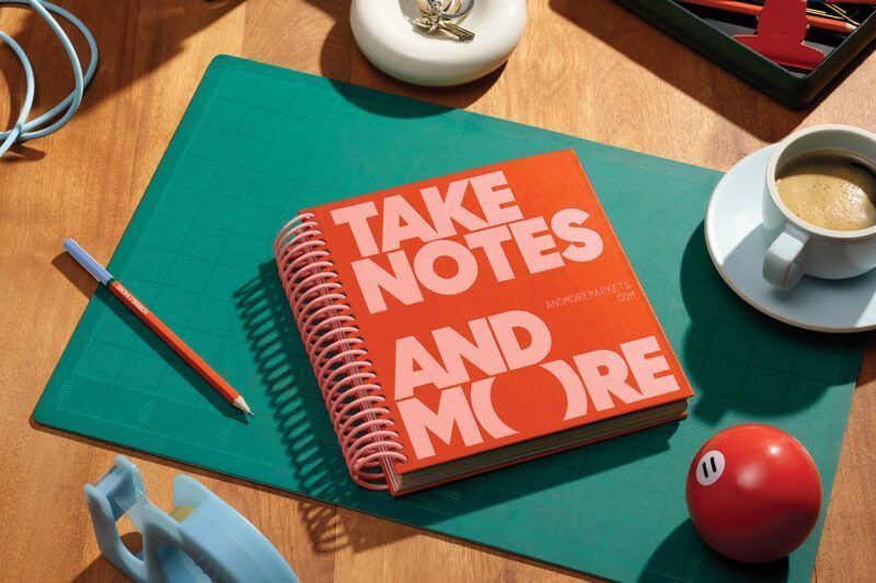
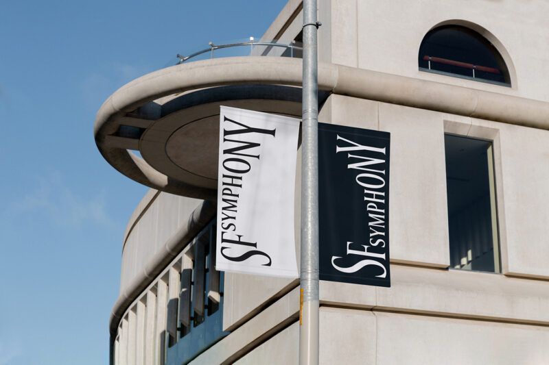
This year OFFF celebrated its 25th anniversary, and you were responsible for creating its new visual identity. What did it mean for you to take on this challenge, and how did you approach it creatively?
It was definitely a significant challenge — OFFF is not just any festival. After 25 years, it’s one of the most relevant events in the industry, with thousands of eyes on it. And not just any eyes: most attendees are experienced designers and experts in the field.
“To us, OFFF is like a magnet, a force with two poles.”
This identity also represents the creative community and all the speakers who participate in the festival each year — many of whom we deeply admire. So yes, the pressure was high, but so was the motivation.
Creatively, many of our projects start in the studio library. We organised an internal workshop to explore ideas away from the screen — to break away from trends and create something unexpected.
OFFF is more than a design festival — it’s a meeting point, a place for inspiration and forward-thinking. How did you translate that into a visual language?
Exactly — that idea of OFFF as a meeting point was key to the concept.
To us, OFFF is like a magnet, a force with two poles. On one side, it attracts the creative community. On the other, it spreads and projects ideas, knowledge, processes and references outward. That dual force inspired the entire identity system.
The identity feels experimental and emotional at once. What references shaped this visual universe?
We were inspired by magnetic forces. Every element in the system was “affected” by that energy.
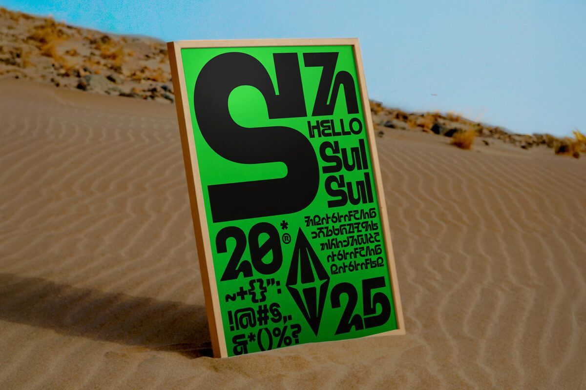
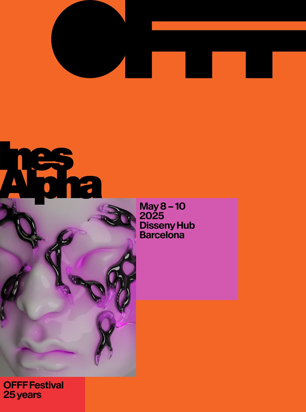
The logo, for instance, compresses the letters of OFFF under strong attraction, forming an iconic and recognisable silhouette. The colour modules that make up the graphic system are pulled toward it — and in motion, the logo literally acts like a magnet, pulling and redistributing those shapes.
Typography and colour also play a key role. The dense, distorted headlines evoke visual gravity. The colour palette is highly saturated and vibrant, creating a dynamic, energetic tone throughout.
OFFF is rooted in Barcelona but has global reach. How did you balance that local-international duality in the design?
That duality was already built into our team. Sergio Lairisa, designer and my amazing project partner, is from Barcelona. I’m from Tarazona, a small town in Aragón, but I lived in Barcelona for ten years and still feel it’s home. Rebeka Arce, our brilliant creative director, is from the Basque Country. All three of us live in New York now.
The global angle was further expanded by motion designers John Choi and Eric Park — both based in NYC but originally from South Korea — and with the brilliant Maddy Carrucan, our Australian copywriter. The wider team included Nick Ace (Chief Creative Officer), Sam Elliott (Engagement Director), and Brian Collins (Founder & CCO) — three essential voices from our New York headquarters.
COLLINS has a very distinctive way of storytelling through design. How would you define your creative approach in one sentence?
At COLLINS, design is more than aesthetics — it’s a tool to imagine and build better futures.
Your work balances strategy, culture and emotion. What role does technology play in this creative mix?
Technology is central to how we explore new formats and expressive languages — like 3D, augmented reality, kinetic typography. But it’s always led by storytelling and strategic thinking.
Tech isn’t the star of the show. It’s a tool that makes things possible — not the main character.
In a world of infinite scrolling and short-lived branding, how do you build identities that feel lasting and meaningful?
We don’t design for algorithms. We design for imagination.
What endures isn’t just what catches the eye — it’s what moves people. At COLLINS, we build living systems with depth, emotion and narrative. Brands that can evolve, speak, make mistakes and reconnect.
“We don’t design for algorithms. We design for imagination.”
It all starts with a story worth telling — one that people can make their own.
Your practice goes well beyond graphic design. What other disciplines shape your creative thinking?
As a designer, I often feel like we’re many professions in one. If you’re working on a project about biomass energy, you have to understand its processes before you can represent them visually. Every project draws from a different world.
Design isn’t just about how things look — it’s about how we experience the world. We draw from many disciplines to create something that not only looks good, but feels alive.
AI is reshaping the creative landscape. What potential — or risks — do you see in its role within narrative and strategic design?
AI has great potential to expand creative possibilities. The risk is losing the human essence of the process.
It can generate patterns or solutions, but it can’t grasp emotional or cultural context — or the ‘why’ behind a story. The key is to use AI as a tool to enhance human creativity, not replace it.
“The key is to use AI as a tool to enhance human creativity, not replace it.”
(*) Images provided by COLLINS.