FLIP-N-FRY: a Berlin restaurant where colour meets taste and design becomes experience
In the heart of Schöneberg, Berlin, there’s a restaurant that does more than serve burgers: it wraps them in architecture, colour, and texture. This is FLIP-N-FRY, the flagship location of a rising burger brand, designed by the acclaimed studio Bruzkus Greenberg, a benchmark in contemporary interior design. Here, every detail has been crafted to create a branded spatial identity as memorable as the flavour of the food.
A space to enjoy, remember — and return to
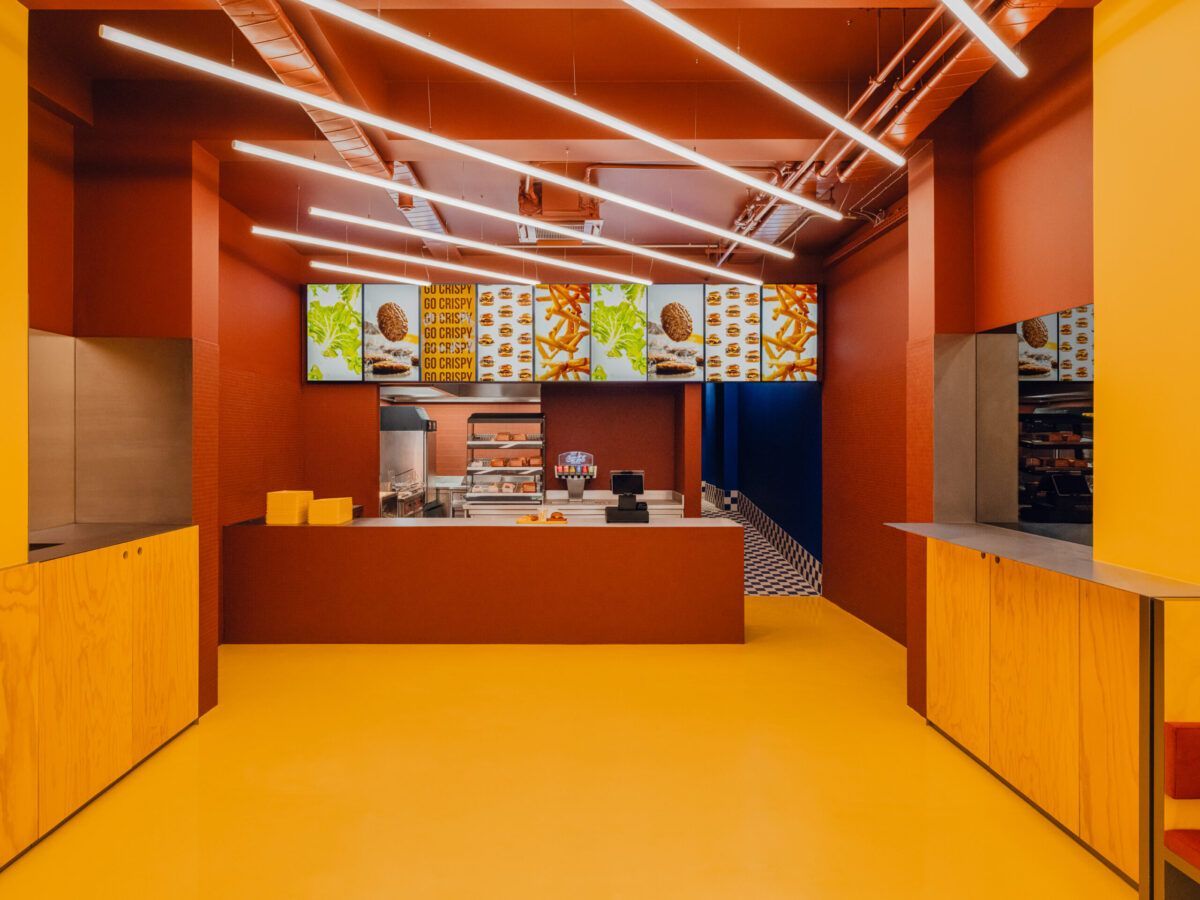
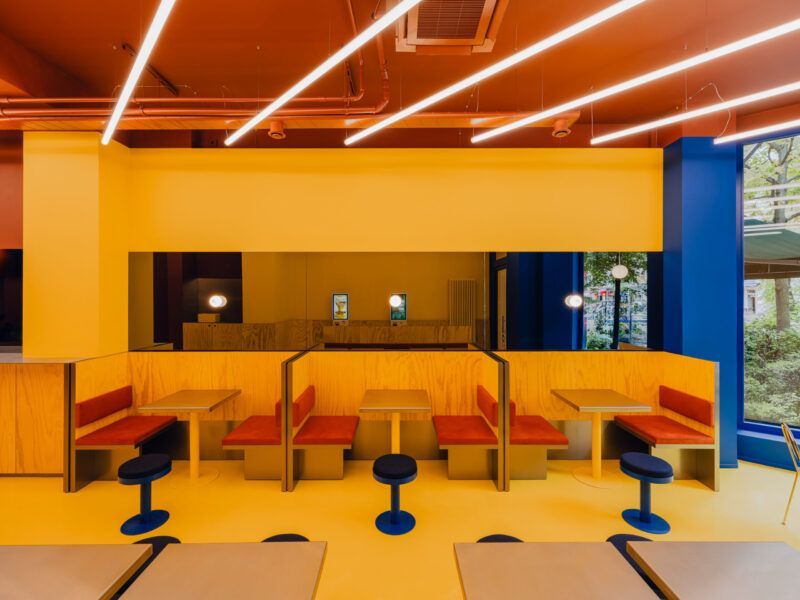
The brief was clear from the start: a space that is colourful, family-friendly, fun, repeatable, and above all, unforgettable. The result is a restaurant that breaks away from the visual clichés of fast food chains, opting instead for a cohesive, playful and highly sensory aesthetic. “The restaurant is supposed to be colourful and fun – but worth looking a little closer at too”, says partner Peter Greenberg.
Colour blocking as emotional architecture
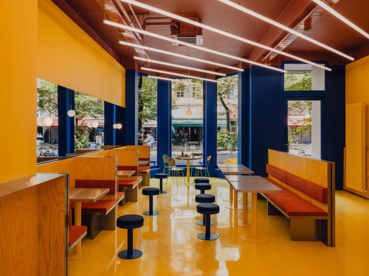
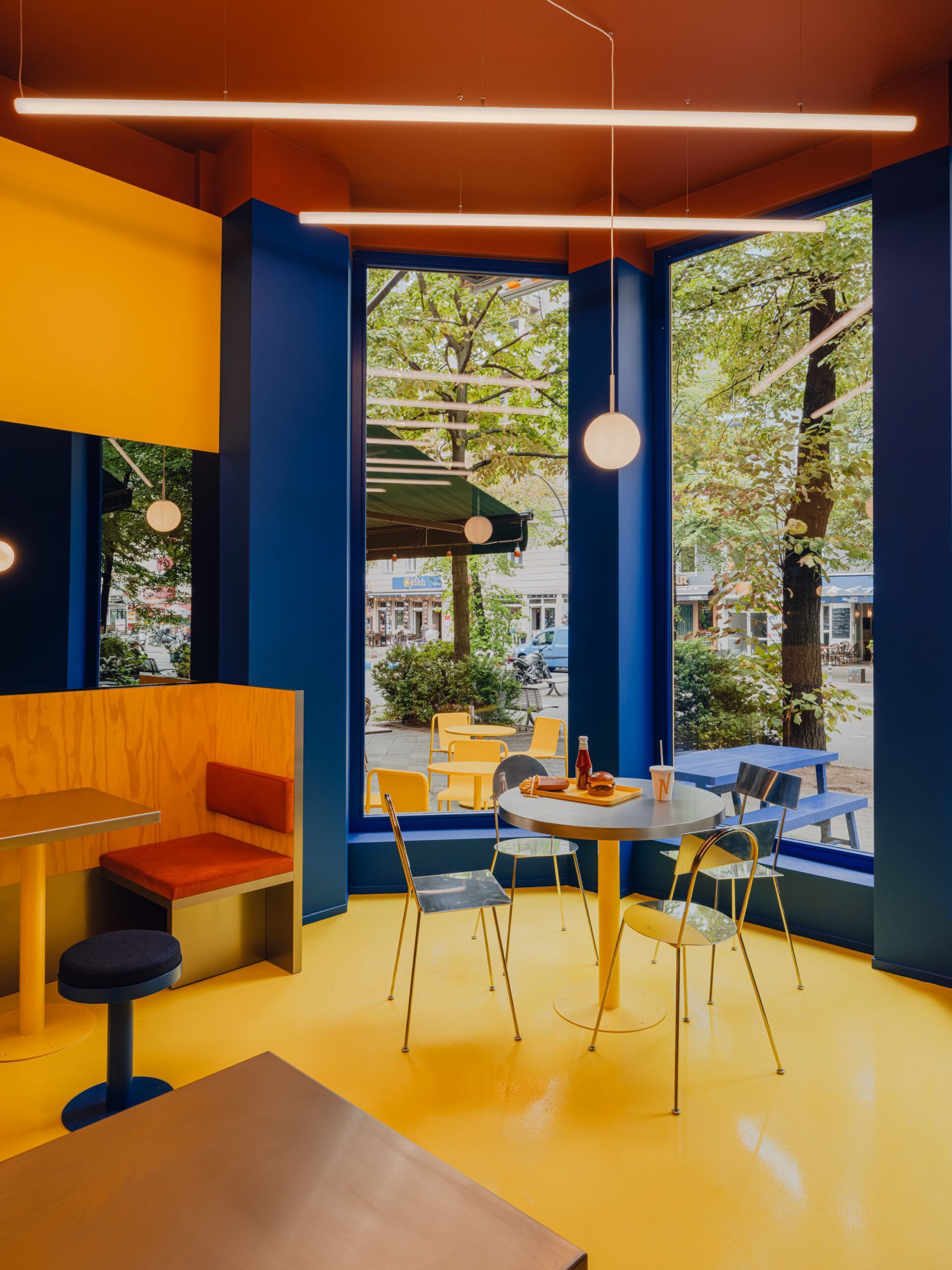
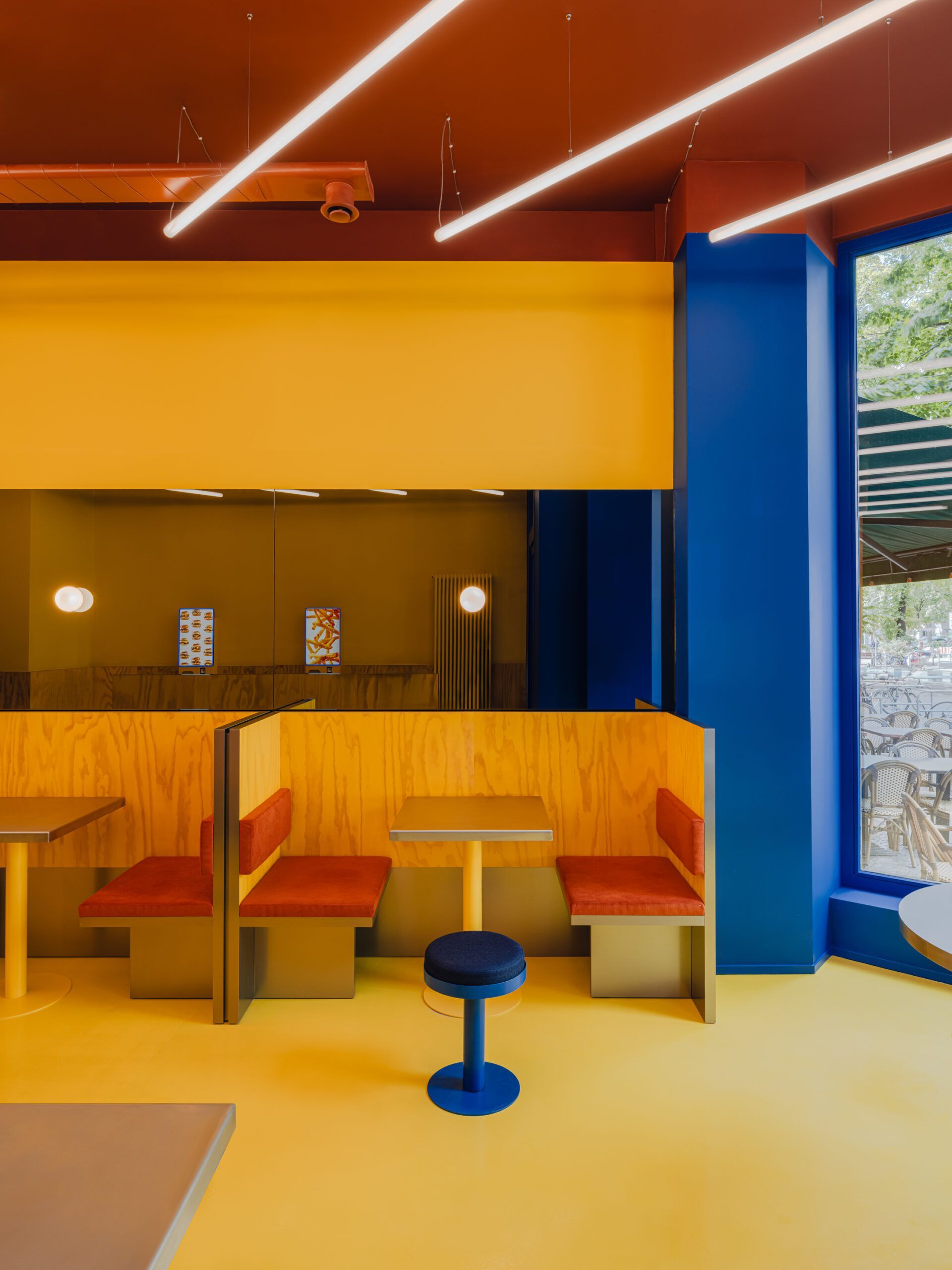
From the outside, FLIP-N-FRY draws attention with expanded windows that reveal a rich interior filled with light and saturated tones. Inside, the experience is organised through colour blocking — a visual strategy that defines functional zones and intuitive user flow.
The yellow marks the order and main dining areas, while terracotta designates the kitchen and food pick-up zones. A terracotta ceiling visually connects front and back, unifying the spaces despite their different functions.
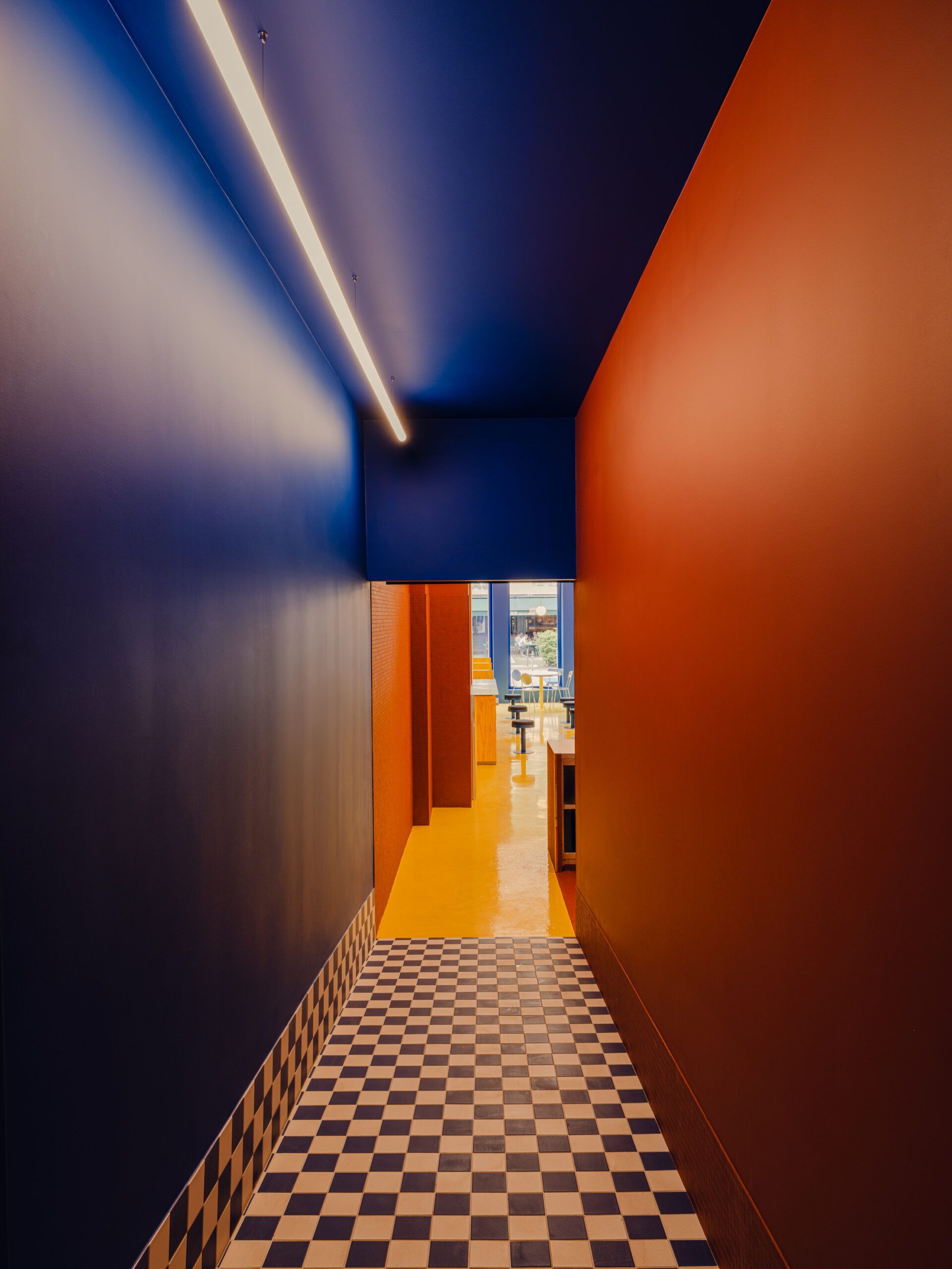
A bold blue signals the transition between indoors and outdoors, and also highlights a dedicated family table placed in the bay window. At the rear, the toilets are defined by a blue-and-white palette that offers a cooler and theatrical spatial experience.
A visual journey from the street
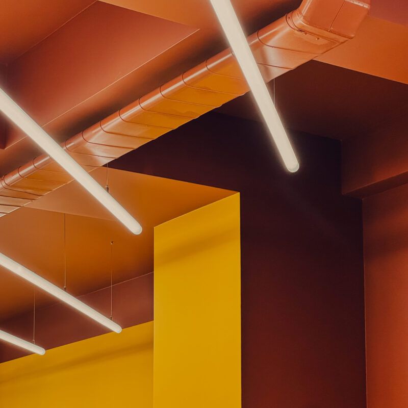
The experience begins before guests even enter. The geometry of the overhead lighting, visible through the bay window, sets the tone for what lies inside. This ceiling lighting doesn’t merely illuminate: it choreographs the space, giving each functional zone its own graphic rhythm. “The lighting forms a graphic pattern that is intended to be identifiable with the restaurant”, Greenberg explains.
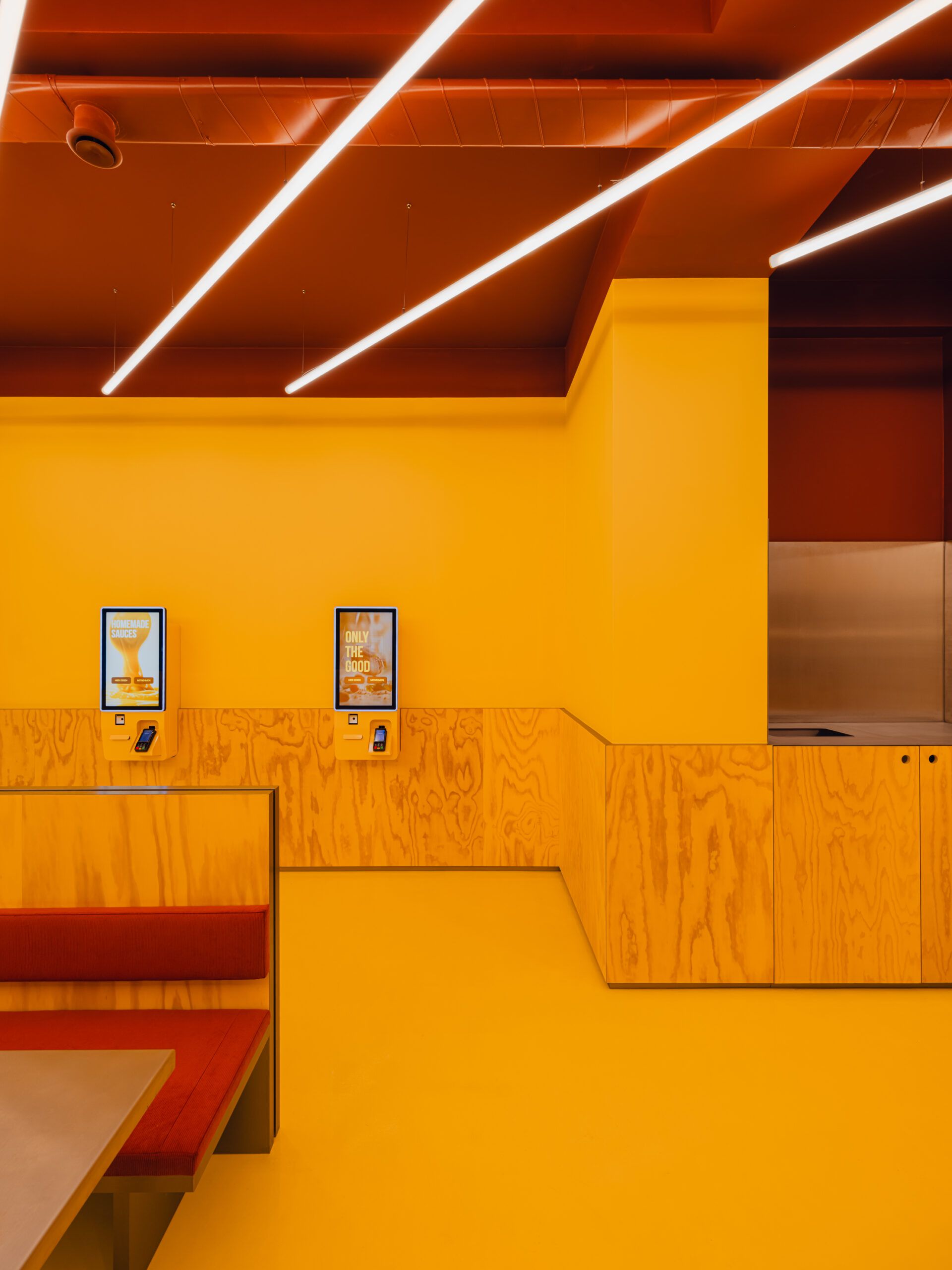
Texture, not just colour
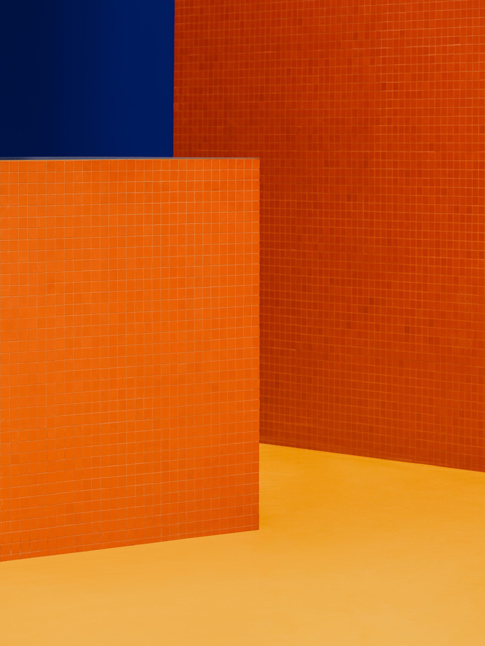
But it’s not all about the colour. As architect Ester Bruzkus puts it, “It’s not just the colours – it’s the textures” . The architectural design developed in parallel with the restaurant’s graphic branding but stands on its own. Instead of flat, painted surfaces, the team focused on material contrast and tactility:
– Yellow-stained wood panels that reveal their expressive grain.
– Glossy epoxy resin floors that reflect light and extend the perception of space.
– Terracotta mosaic tiles on counters and walls, providing tactile variation.
– Soft-matt stainless steel detailing that anchors and connects every design element.
Bespoke furniture and human-scale comfort
Custom-built furniture structures the space and enhances the guest experience. The banquettes are made of stainless steel, yellow-stained wood veneer and soft upholstery — blending hard and soft, matte and glossy.
This nuanced combination is both visually engaging and ergonomically inviting.
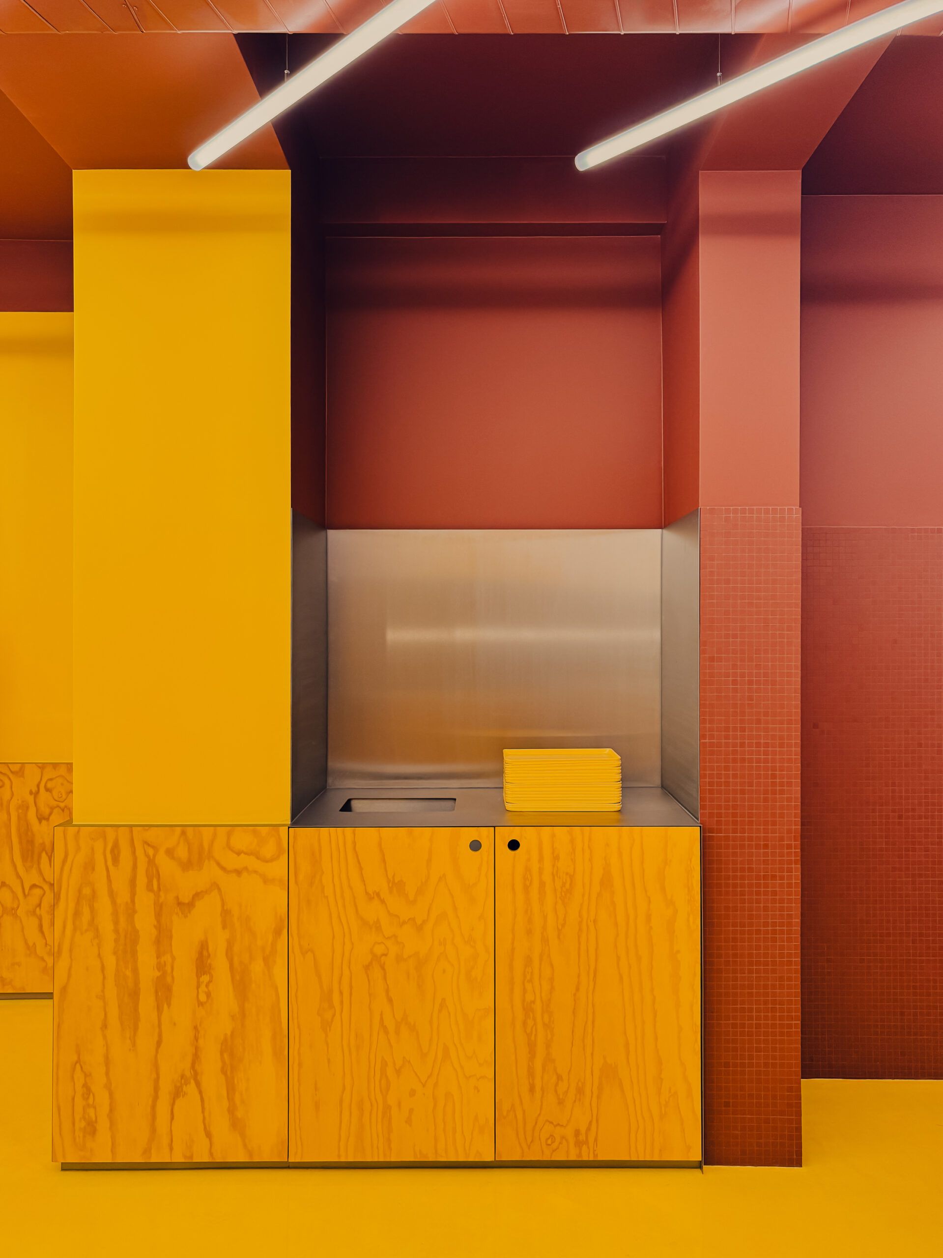
A stainless steel datum line encircles the entire restaurant, integrating cabinetry, counters and the food pick-up station into a seamless whole.
Designed to be replicated
FLIP-N-FRY is not a one-off. It’s a scalable spatial prototype designed to be adapted across future locations. That’s why each design decision — material, layout, lighting — is both distinctive and repeatable.
The brand identity relies not on logos but on a powerful combination of colour, form and light. You don’t just see the space — you experience it.
Respecting heritage through clever replanning
One of the project’s early moves was to relocate the entrance of the space, housed in the ground floor of a listed turn-of-the-century Berlin building.
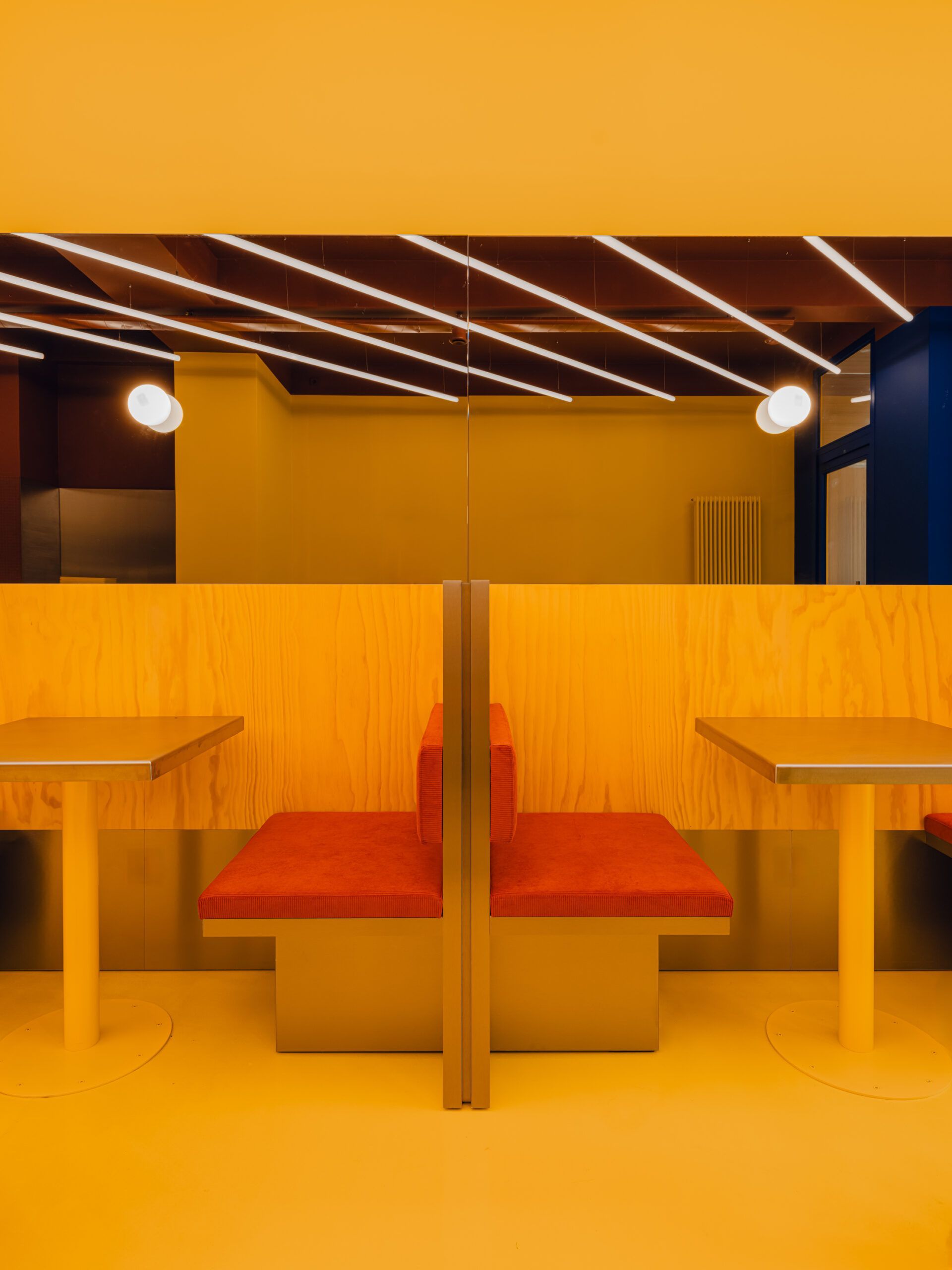
Originally narrow and deep, with light only from the front, the space needed reconfiguration. The historic bay window, previously used as the entrance, was transformed into a family seating area with a bespoke table and pendant light.
The connection between inside and outside is enhanced by maximised glazing, allowing passers-by to appreciate the design’s graphic interplay of light and material.
“The lighting forms a graphic pattern that is intended to be identifiable with the restaurant.” Greenberg
Light as brand language
Lighting design by Studio DeSchutter works as both architectural element and branding tool. Ceiling fixtures form geometric patterns that reinforce the internal organisation and create visual rhythm.
More than decor, the lighting becomes a brand-defining element for future locations.
A play of contrasts, surprises and detail
Bruzkus Greenberg’s philosophy thrives on architectural precision and emotional surprise. Their projects dance between opposites: thick and thin, smooth and textured, soft and hard. FLIP-N-FRY is no exception.
“The design limits the total number of colours, but enhances their saturation and contrast”, says Bruzkus.
Architecture as brand narrative
In a world of copy-paste franchise interiors, FLIP-N-FRY proves that the physical space can be the story itself. From flooring to lighting, materials to flow — everything contributes to a narrative guests can see, feel, and remember.
“The design limits the total number of colours, but enhances their saturation and contrast.” Bruzkus
A signature studio with global vision
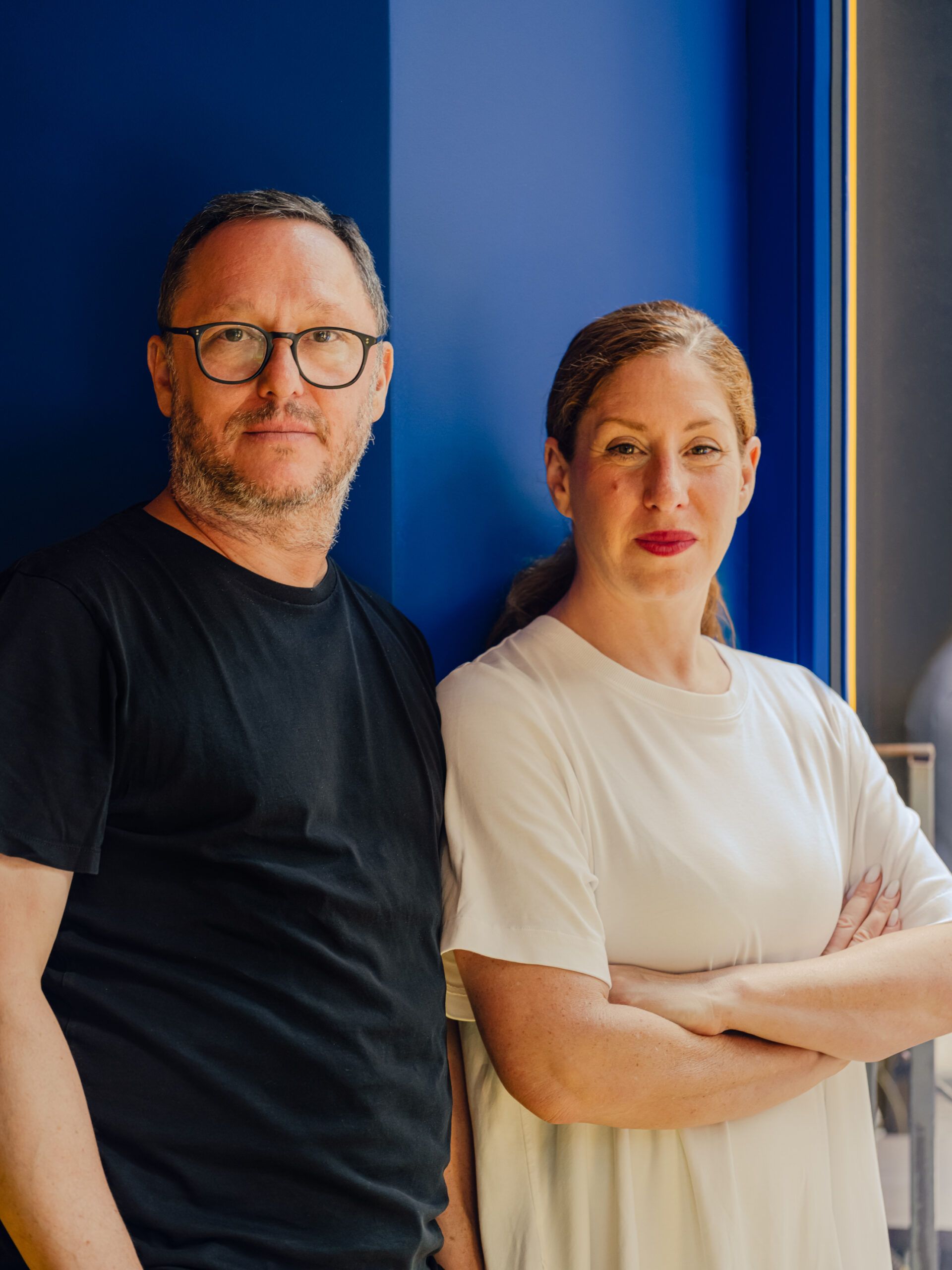
Led by Ester Bruzkus and Peter Greenberg, Bruzkus Greenberg has built a portfolio that ranges from restaurants and hotels to residences, workspaces and exhibitions.
With a foundation in Paris, Berlin, New York and Boston, their work is defined by material richness, precise planning and playful conceptual clarity.
FLIP-N-FRY is a vivid example of how a great burger can start on the drawing board.
Project Details
Location: Schöneberg, Berlin.
Area: 120 m².
Completion: 2025.
Design: Bruzkus Greenberg.
Team: Ester Bruzkus, Peter Greenberg, Anna Kopeina, Sina Hartmann, Leonie Stier.
Lighting Design: Studio DeSchutter.
Materials: stained wood, terracotta mosaics, stainless steel, epoxy resin, fabric upholstery.
Colour Palette: yellow, terracotta, blue, white.
(*) Photos by Pion Studio and Architecture_in_a_blink.